Quantcast
Channel: Resources Archives | The Logo Smith
Viewing all 224 articles
Browse latest View live

Logo Design Ownership: Make it Easy For Your Client To Own The Logo [AQfG]

$
0
0

I’m seeing, and hearing about, cases where some logo designers are not making the practicalities of logo design ownership straightforward for their clients. I have also heard of some designers refusing to actually grant, or transfer, copyright/ownership, over to the client at the conclusion of the project. I have even heard of one or two unscrupulous logo designers holding clients to ransom over the subject of how owns what and when!

A few people who have been looking around for logo designers have come back to me asking for advice on this very subject. I’m quite surprised that some logo designers are not behaving themselves in this regard! An important topic to address in another A Question for Graham post.

Both of these situations are not at all desirable, and if you are one of these designers who is not upfront about who will own sole ownership of the design you create for a client, then shame on you. Also shame on you if you are a logo designer who flatly refuses to grant their client sole ownership and provide transfer of copyright to a client who has paid up.

If a client pays you the money for the work you have done in creating them a unique and professional logo, then there is no reason at all why the client then should be wondering if this design will be used by another client later down the line, or simply if they will be granted ownership of the design. The clients needs and deserves to know that the logo design they are paying you to create for them, is theirs and theirs alone.

Logo Design Ownership

Make the subject of logo design ownership, and transfer of copyright, one of the more obvious topics in your proposal.

Provide a Transfer of Copyright/Ownership form so your clients, and prospective clients, can rest easy knowing that they will own the work they have contracted you to do for them.


Read Logo Design Ownership: Make it Easy For Your Client To Own The Logo [AQfG] on The Logo Smith - forging logomarks of distinction since '86.


Awesome Vintage Publicising of the Public Gothic Font by Antrepo

$
0
0

public gothic font

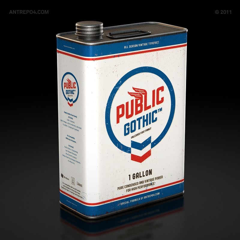
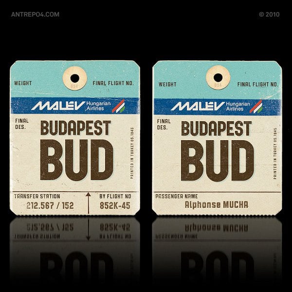
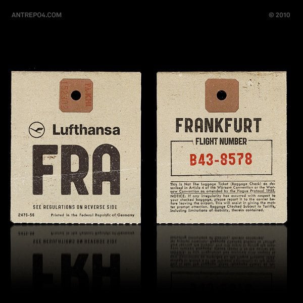
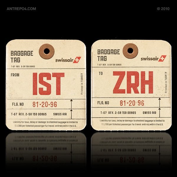
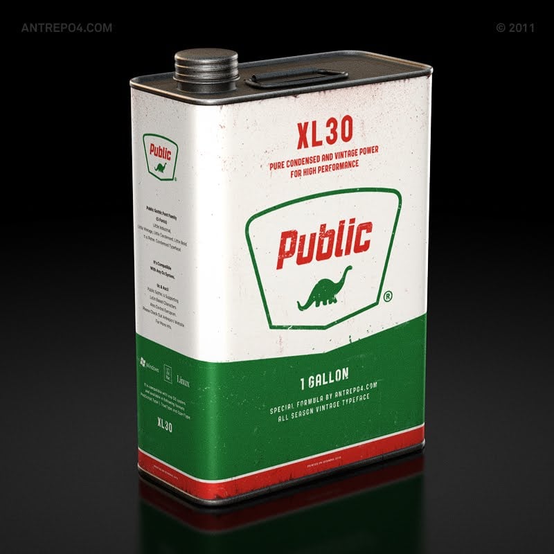
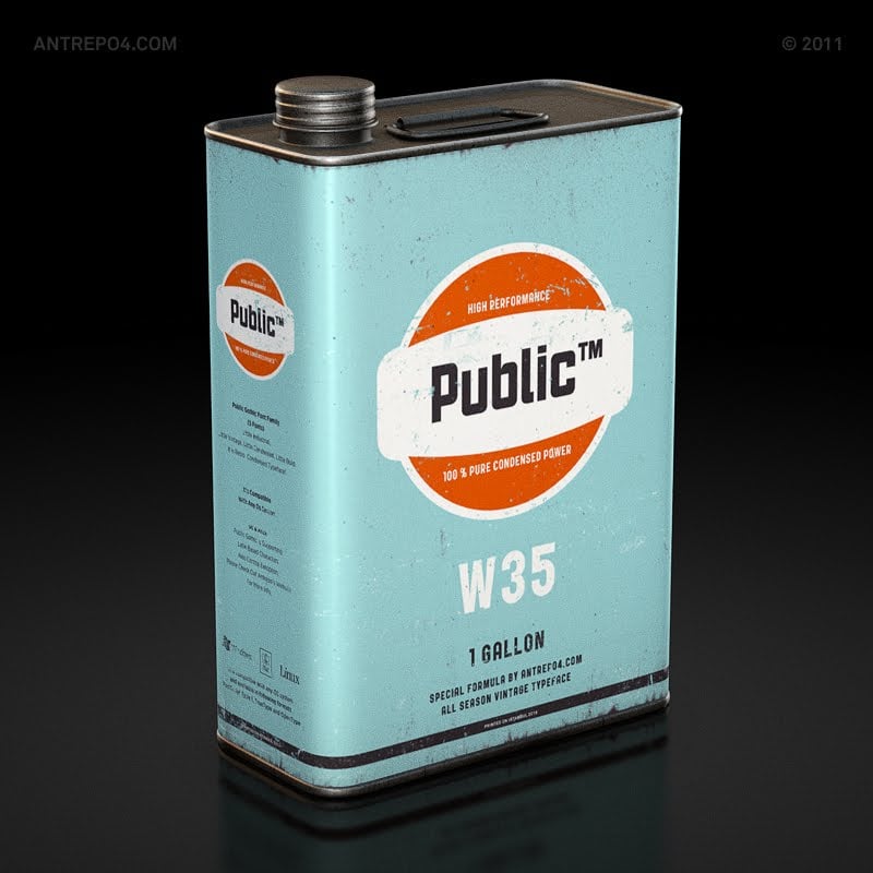
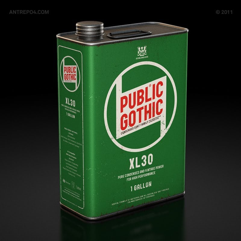
Here’s some tasty visual inspiration for a Sunday afternoon for you. In terms of nailing the marking and promotion of their vintage style font, Antrepo sort of hit it smack bang middle of the head.

Awesome graphic design work, not to mention superb vintage style typography to really drive home the visual message of their font: Public Gothic.

Those vintage style cans are so perfect: the colours, the layout, the distress, everything about the graphic design is spot-on. If you don’t have your own copy of the Public Gothic Typeface family, then seriously think about getting it at the following link: http://www.antreposhop.com/product/public-gothic-font-family

It’s certainly a worthwhile addition to your vintage typeface collection. Here are some of the details:

Public Gothic
Font Family (5 fonts)

It is little industrial, little vintage, little condensed, little bold.
Public Gothic is our new retro typeface! PB family members are PG Square, PG Vintage, PG Circular, PG Federal, PG Little and Italic variation of PG Square, PG Circular, PG Little. It’s compatible with any OS system.

public gothic font

pbce02 pbce03


public gothic font

T04 T02-1

public gothic font

public gothic font

public gothic font

public gothic font

public gothic font

Read Awesome Vintage Publicising of the Public Gothic Font by Antrepo on The Logo Smith - forging logomarks of distinction since '86.

Proper VIntage Porsche 356 Color Charts

$
0
0

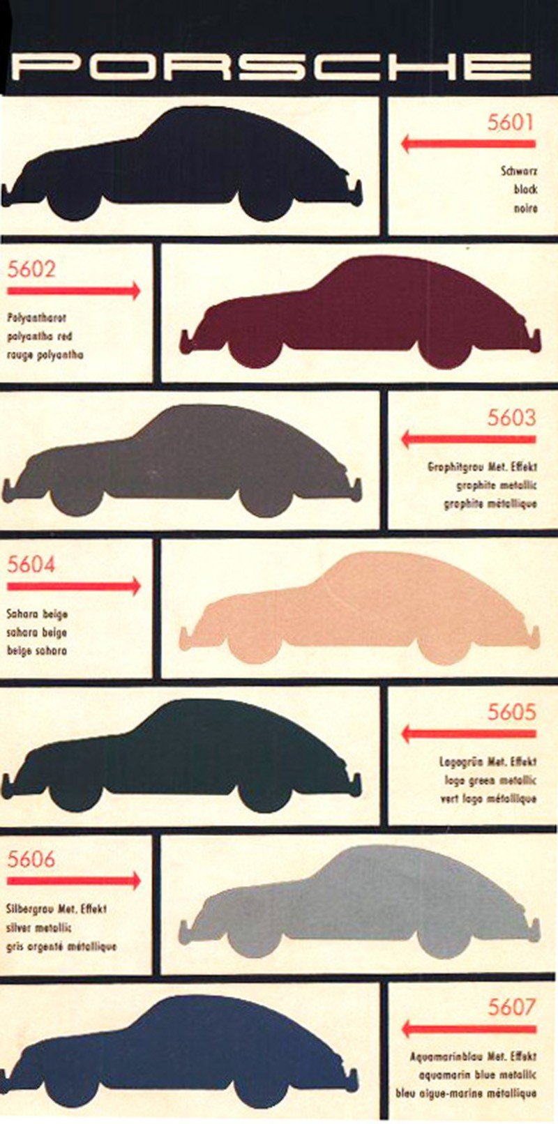
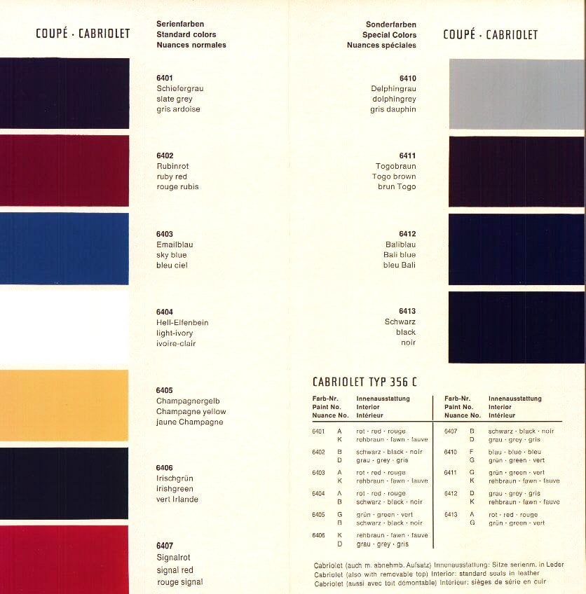
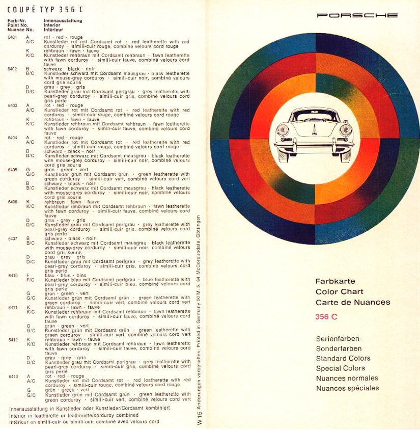
Porsche 356 Color Chart

Porsche 356 Color Chart 2  Porsche 356 Color Chart 2

This Porsche 356 Color Chart is rather seductive. Little bit of auto creative inspiration for this New Years Day. Really liking the circular ‘infographic’ style graphic on the front page, quite rad.

Found via http://design-is-fine.org

Read Proper VIntage Porsche 356 Color Charts on The Logo Smith - forging logomarks of distinction since '86.

Asking Clients for Full Payment Upfront [AQfG]

$
0
0

As part of my A Question for Graham series [AQfG], Chris from PixelHatch, emailed me a follow-up question with regards to an earlier post of mine on the topic of asking clients for the full payment upfront, opposed to the more usual deposit/balance format.

“I read your blog post on charging 100% up front and this is something I’d like to do in the future. In my mind it doesn’t make any sense to work on a deposit since it’s always possible for the client to just not pay you at the end and there’s not really much you can do about it.  

My only concern is that because the idea of a deposit and payment on completion is so accepted in the industry I’m scared of putting clients off. Do you have a particular way that you explain this to new clients without scaring them away? Would be very grateful for any advice.”

There’s no denying that asking for full payment upfront for a logo design, or any graphic design for that matter, often has this perception of being a rather ‘cheeky, and/or taking the piss’ method of cash collection. Alternatively, when asking for full payment is not appropriate, I tend to stick with my Deposit & Progress Payment Strategy.

I can only really go on my own personal experience of charging the full whack up front, and hope that this might offer up something useful for other designers who feel this is worth considering.

For context, in my early days, I was simply ripped off too many times by clients not paying the final invoice after I had delivered my end of the deal. A lot of that was a result my own inexperience of being self-employed, but also I had a tendency to over-trust people. What a personal failing, I know…

I tried, over a few years, various methods to protect myself against non-paying clients, but it’s simply impossible to do 100% of the time due to the sheer vulnerability of ‘putting your idea out there’ before securing some, or all of your money. Once you show that logo design idea it simply leaves each and every one of us super vulnerable to being cast aside.

On one hand: some clients feel untrusting towards a designer to pay the full amount upfront (even a heft deposit!), and equally a designer may be untrusting of a client to pay the final balance when it is due.

Where is the trust

My feeling is that if a client approaches you to do them a logo design, then it’s simply up to them to find the trust to place in you, not the other way around. Maybe you have a great portfolio, loads of testimonials, a regular and transparent social networking presence, various communication methods etc: all of these things ought to provide comfort to a possible client. If they still have trust issues that you will not deliver, then I wouldn’t personally want to work with them in the first place.

Assuming that both parties have done their due diligence with each other: client checking out the designer, and the designer asking the right questions and providing adequate information, then there should be no reason why a client will not consider paying the full amount up front. Other than the obvious: not having that sort of cash laying around, but if that’s the case who’s to say they will have it 4-8 weeks down the line? If they don’t have it all now, who’s to say they’ll have it a few weeks later, and I do think many clients end up in this problem of hiring a logo designer, paying the deposit but simply unable. or unwilling, to then pay the rest.

Just look at how our society ends up in constant debt by buying things they can’t afford with credit and overdrafts, all the time having the noble awareness and intent of settling that debt at the end of the month. If some of us struggle to pay off that card for a new car we have just purchased, then I also slightly worry about the importance placed on paying up for a logo design once it’s been done. After all, once it’s been done, the designer has shown it to you, the novelty sort of wears off, and you are then faced with the reality of forking up more money. OK, so that’s a somewhat cynical view, but it’s also not really all that far from reality.

As a materialistic society, once we have what we want and have not yet fully paid for it, then trouble is just around the corner when we are faced with that final invoice/credit card statement etc. I have seen this, been a victim of clients simply not having the funds when the time came, and I just got royally brassed off about it.

Hence the full payment up-front seems to actually prevent more problems than more common methods.

Clients DO like paying all up front

And, do you know what? Since I offered this on my initial proposals easily over 80% of all my past clients have offered to pay the full amount, rather than the traditional 2-part deposit/balance approach. Oftentimes we are talking about a client finding, and happily paying between £1000-£8000 before they have even talked to me on the phone!

Now that is what reinvigorated my sense of trust in people. I have been continually bowled over by the continued, and seemingly lack of distrust, that all my past clients have exhibited towards me. So, if I have worked with clients that have, historically, shown no apprehension whatsoever to pay the full amount up front then it surely shouldn’t be such a taboo subject to raise?

Just want to make it clear that I don’t DEMAND full payment, although I did go through a period of a few months when this was the case. I provide two options of payment, but with a nice little incentive for a client to pay the full amount. Don’t underestimate the hassle some larger companies have when it comes to paying, or having to arrange with their finance department, their own invoices etc. It’s been explained to me by more than one client that it was simply case of, paying the full amount up front that is, being easier to arrange than two staggered payments. Plus, of course, they go get a genuine reduction, which the bigger the budget, the more it makes sense.

Advice

So my main chunk of advice, if you are worried about asking clients to pay all up front, especially if the project is going to take a few months, then at least offer both options. When doing so provide ample reasons and incentives for them to pay the full amount up front, but don’t box them into a corner.

Once you get your first client accepting full payment, then you’ll find more confidence to ask the next time round and so on and so on, which was pretty much the case for me. I certainly did feel cheeky asking for the full amount the first few times, but once the first few clients happily obliged, it became routine.

The other way to try is to simply have a FAQ page that gives fair warning to a client about your payment options before they might even get in contact. They are not forced into using you, or accepting your terms, but they are your terms and your business, and if they want you as a designer then they’ll need to seriously think about trusting you. It’s mostly as simple at that.

Sometimes my gut tells my I need to tread cautiously with a particular client, so in these cases I might just offer up the Full Payment Upfront, and no 2-part option. Obviously always a risk they’ll move on and find another client, but I’ve learnt to trust my gut and also not sweat it if a client gets narky about your payment options.

I probably have three or so proposal templates, and tailor each one depending on the vibes I get back from the potential client, as well as taking into consideration the budget, scope and length of time I expect to be on it. If it’s going to be closer to two months on one logo design project, then I’ll make sure I’ll either get the full payment up front, or at least ensure I have a staggered Progress Payment in play.

My current proposal layout

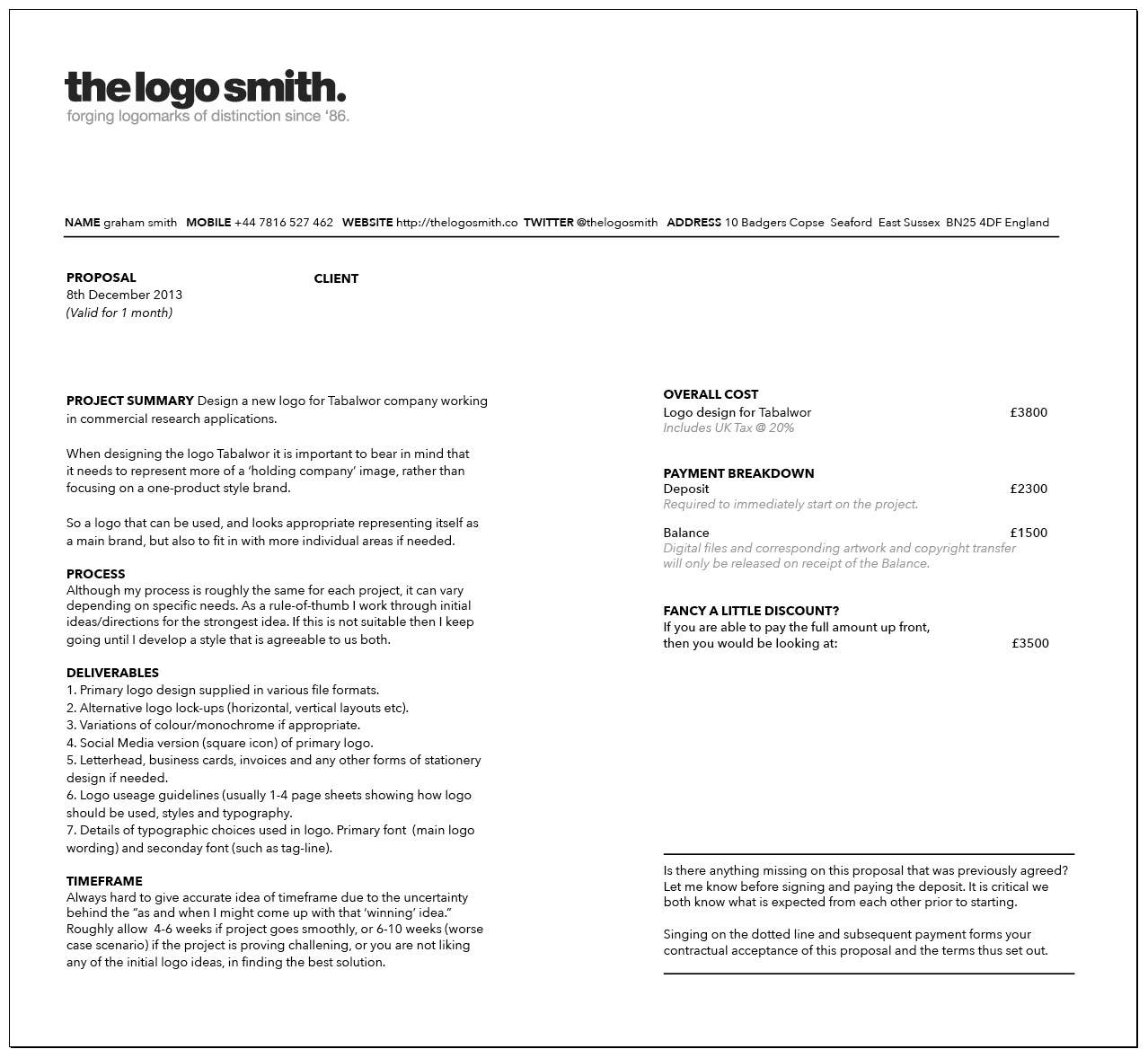
I’m continually changing the layouts of my proposals, but the current version shows you how I typically will present the full payment option to the client. You can see that I first offer up the total cost, in this case £3800. Then I choose to provide a standard 2-part Deposit and Balance method with the Full Payment option underneath with a nice little discount as an incentive.

Screenshot 2014-01-02 13.43.48

Read Asking Clients for Full Payment Upfront [AQfG] on The Logo Smith - forging logomarks of distinction since '86.

The Horror of Logo-Design-Approval-by-Committee

$
0
0

One of the more frustrating scenarios when working as a self-employed logo designer is the ‘logo-design-by-committee, or more precisely, the horror of ‘logo-design-approval-by-committee’. Obviously nothing touches on non-payment, but this whole shit-bags worth of: every board member, CEO, Director, MD, partner needing a say in what passes as a solid logo design for their new identity, really frosts my y-fronts.

The one thing that I can guarantee that will completely ruin your month, and screw you right up in ways you didn’t think were possible? You believe you are working with the one person who is responsible for the smooth passage of the logo design process, you have established a great designer/client relationship, and you feel that this is a perfect, almost symbiotic, relationship.

They are critical but constructive, they are enthusiastic as well as grounded, they don’t allow their personal subjective views of design to interfere with the logo design process, as they are clearly aware that what is right for the company, may not be right for them as an individual.

You are feeling so positive, so motivated and enthusiastic, that you are so personally and professional behind this new logo design in every possible conceivable way, that you almost feel invincible. Why of why can’t every logo design project goes as smoothly, and as fantastically enjoyably as this one?

During the critical part of approving and/or fine tweaking an idea to reach that ‘so close I can smell it’ project conclusion, when you both have expended huge amounts of emotional and physical energy in the creation and formulation of the company’s new identity, your soul is crushed, shredded and vaporised into the closest and biggest black-stinking-hell-hole.

How so? (By the way, if this doesn’t sound familiar to you then I hope you never ever have to become familiar with it.) At some point towards the apparent end, your amazingly cool client confronts you with, something along the lines of, “Well, now we have really created something amazing together, I’m going to present this to the board for their approval.”

Queue temple and blood vessel throbbing of such extreme proportions that you want Thor’s Hammer to smash repeatedly in their face.

Your brother-in-arms, your go-to-person, the best client ever, turns out not only to not be part of the actual logo-design-approval-process, but they have somehow, and quite incredibly, been working to a brief that is completely foreign to the newly introduced logo-design-approval-committee.

This is that moment in a logo designers life where you can literally feel the will-to-live ebb from your body. The bewildering realisation that what they have been on some kind of personal mission that shares absolutely no similarities with the completely different views/opinions of the logo-design-approval-committee.

The premise that a logo designer is ideally designing with their clients and customers mostly in mind, and mostly not to personally please and serve each member of the committee, is of such horrid foreign nastiness, that they laugh and spit in your face.

It goes without saying that the story doesn’t end at all well for all concerned, but it can be, and absobloodylutely needs to be avoided at all costs.

When you are close to confirming a new client you must, at all costs, ensure that the person you will be liaising with understands the following: that all persons, who will have say into the final design, are both kept up to speed during the project, and that any conflicting feedback they might have at any point during the project, is filtered into one cohesive voice before landing back on your table.

It is of no use for a client to send you 5 differing set of views on your latest logo design proposal, because every one of the 5 members of the logo-design-approval-committee have completely different opinions on what sort of design should be adopted. If they are unable, between them, to come to a mutual agreement about which opinion to go with, then that’s more of an issue for them to resolve, not the designer.

For sure, I sometimes find it interesting to hear what these conflicting thoughts and opinions are, as they can actually create useful insight, but that’s only when I know each member of the collective understands that the new company logo isn’t going to be a personal reflection of their personal taste in design, and that the current set of comments have already gone through the process of being filtered into one collective voice.

Never allow/tolerate a client to surprise you, and put you in that very difficult position of having to wade through, and somehow make sense of, conflicting thoughts and opinions about the latest design proof, when you have previously been lead-to-believe you had been on the right track. It’s simply not on, and also reflects poorly on the client if internally, they can’t see eye-to-eye on something as crucial as their brand’s new logo and identity design.

The key-word above is surprise. I think there are always exceptions to this rule, but only if you are confident about taking control, banging heads together, showing them you are the boss/professional etc.

You might already be aware, before getting too deep into the project, that there is a possibility of some challenges in getting people on the same page. Also, maybe the person you have been working so closely with, and whom sincerely believed they WERE working to a unified brief, are themselves surprised by those members of the logo-design-approval-committee. In these cases you can allow for time, maybe charge additional costs for time-wasted etc, but the worse possible case is having your go-to-person lead you on a merry dance all the way to the gutter, especially when you’ve done nothing but follow all that amazingly positive feedback for week-after-week.

I have been known to pull the plug on the whole project if no one from the committee shows any willingness to budge/compromise on their own personal views. There really are times when there is no way to move forward until the committee can see how their collective stubbornness is actually damaging the natural evolution of the company’s brand.


Read The Horror of Logo-Design-Approval-by-Committee on The Logo Smith - forging logomarks of distinction since '86.

The Absolut Logo Comes of Age

$
0
0

Absolut Vodka logo design by Absolut

Once in a while a rebrand (logo redesign ) comes along that simply looks like how it should have always been. By that I mean the revised logo simply looks like a natural evolution, but at the same time immediately becomes the ‘right’ look, almost immediately more appropriate, than the logo before. Not sure I’m explaining myself very well here.

To me the new Absolute logo, minus the ‘Country of Sweden’ & ‘Vodka’, works better than the logo with the additional lines. Pretty sure that’s also widely agreed.

Absolut Vodka old logo design by Absolut

That’s not to say the previous version sucked balls, far far far from it. Sometimes, in order to minimise/defluff a logo, the brand must have become so well established, adored and imprinted in our minds that stripping the fluff away to reveal the core element, in this case down to just Absolut, looks like the completely logical, and right thing to do.

Then the magic of hindsight kicks in, “why wasn’t it done before now”.

When the new logo simply and transparently slots into place without so much as a ripple, then you know that a brand has become deeply imbued into our psyche.

The Spirits Business: Anna Kamjou, global director of Design Strategy at The Absolut Company, said: “The brand has become so iconic that we no longer needed the full three-line logo to convey ourselves.

The same holds completely true for Starbucks, Nike and Apple. When each one of those companies simplified their logos, it signalled the arrival of maturity, strength and dominance, in an all too crowded world. When a company believes they can safely remove core elements from their logo, and that logo then, somehow, becomes stronger than more iconic than before, well, that’s just magic.


Absolut Vodka mono logo design by Absolut

The Spirits Business: The Absolut Company, which is owned by Pernod Ricard, claims the changes won’t be noticeable by most consumers, but will “strengthen the brand’s iconic status as a contemporary, forward thinking brand”.

Anna Kamjou, global director of Design Strategy at The Absolut Company, said: “The brand has become so iconic that we no longer needed the full three-line logo to convey ourselves.

“By removing ‘Country of Sweden’, and ‘Vodka’, we’re putting the focus on the most important part of the brand – Absolut. The word itself not only means the perfect, the complete, and the ultimate, but it also means the open-ended, infinite and indefinite.

Absolut Vodka white logo design by Absolut

Absolut

Read The Absolut Logo Comes of Age on The Logo Smith - forging logomarks of distinction since '86.

Principles in Logo Design Pricing: Courageous, Responsible or Downright Foolish?

$
0
0

I had an interesting experience a while back that really has caused me to reflect on certain priorities I place regarding my logo design business, specifically in the area of logo designing budgets and quotes.

I have been there, and done that. I started out as a freelancer logo designer charging around £250 for logos thinking that was the dogs bollox, then realising I would need to do at least six of these a month just to pay the bills, mortgage, keep my dogs etc. Completely unsustainable, unless of course you are not sharing your earnings with the Inland Revenue: in which case you can charge less than someone who is a registered tax payer, or you’re churning out soulless logo after soulless logo, (both examples are another story for another day).

Over time I realised I could justifiably raise my prices as my own profile and quality of logo designs, in my portfolio, grew and grew.

Epic Pricing

There are plenty of examples where one company or another have supposedly been charged gazillions of £££’s for a logo leaving the whole socialmediasphere agog. We all know, and like to think, that we could have done a better job, or an equally crap job, for whatever is substantially less than gazillions of £££’s.

In my own little world I just sit and ponder these moments, and like to pretend I’m that agency boss who’s scored a crazy ass amount of money for a few months work. I like to wonder about how I was able to justify such a huge mount of money as well as wondering how on earth the client saw past such greed and treachery.

It’s actually pretty easy to find a way to supposedly ‘justify’ any amount of money when it comes to something as important and as unquantifiable as the value of a logo and brand identity design.

It’s pretty shocking how much logo design pricing can vary from one designer/agency to another, but this is mostly to do with each project being unique in so many ways, not to mention so many ways to achieve an end result. Sometimes it feels to me these ‘others’ base their astronomical fees on nothing other than how much coffee will be consumed in the anticipated process, and execution, of the latest client windfall (especially at Starbucks prices).

The Point

One day, out of the blue, I was approached by a national airline to redesign their existing brand logo.

Like really, what the fuckety fuck? This never happens to me. How on earth has a national airline considered my modest portfolio worthy of a hire?

During the discussions I was told that money was not an object, hardly surprising really, or so you might think. They desperately needed to redesign the existing airline logo due to various mergers and fleet acquisitions. The existing logo was ‘meh’, and the new logo needed to be ‘ohhhh la la’.

Goes without saying I was still shocked and awed at the possibility of creating an airline logo. I mean man, you realise how many places the logo will be used, seen and flown to around the world? Not to mention the dazzling update to my portfolio, and the heaps of praise and adulation I would surely receive.

The initial brief didn’t cover the whole brand identity: the immediate task was to redesign the airline logo, then the rest of the company’s identity would be updated in accordance with the logo’s style and aesthetics. Not the best way to roll out a new brand logo, but they were insistent that this was the way it would happen.

The Proposal

I came up with a proposal, that as best as I could, explained and meticulously detailed the work needed to research and develop this national airline’s new logo design, which covered (not a full list): studying competing and non-competing airlines; researching the country’s culture; familiarising myself with the airport layout, the terminals, trucks, uniforms, check-in desks, signage; studying all the blueprints for all the different models of plane (different sizes and proportion of tails and fuselage, meaning that the placement of the logo needs to work as consistently as possible across all the fleet, regardless of how small or big the plane, and ensuring the logo looks epic up close and from 100′s of feet away), as well as studying the rising trend in other airline logo and brand identity redesigns, of which there are many.

I tried to work out how much time this would all take, and came up with what I knew to be a stupidly low quote, but it would also be the biggest quote I would have ever presented. Kinda weird really.

I didn’t want to be greedy, neither did I want to undersell my experience, skill and general professionalism.

I battled with myself over the budget, it was the hardest thing to come up with and send over. I was confident that I had, in super detail, explained and justified the cost, but I was ultimately in unknown territory.

The Quote

I quoted £25k which I knew was chicken feed for an airline, and I was convinced they, upon seeing the quote, would be rolling about on the floor, laughing at their good fortune. I was OK with that, but I did wonder if I should have quoted at least double that, because even £50k seemed a steal given the scope and general prestigiousness of the job.

Regardless, this would be a lottery win. Massive job, challenging in every way, and let us not forget the exposure this would bring a humble self-employed logo designer working from his spare bedroom in a sleepy seaside town.

I mean my God, an airline logo in your portfolio!

I sent the proposal and patiently waited for a response. One day, two days, three days and nothing. After a week of no response, and a unmistakable feeling in my gut, I flicked over a quick email.

Crash and Burn

My gut typically gets it right: apparently my quote was far too high for them.

Queue the despair and confusion. What did I do wrong? Had I been too greedy? Should I have just gone for a £5k quote to score one of the biggest jobs in my career, and reap the rewards from the exposure?

The reality is, even with all this self doubt, constant evaluating of the what if’s, who really knows if the result been any different if I had quoted less, or even more.

I did find it slightly strange a national airline would go with a self-employed logo designer, rather than a multi disciplinary agency given the sheer scope of the project. The thing is: I wouldn’t have taken it on if I didn’t honestly feel I could deliver, so I did have complete faith that I could, and would have, delivered a winning new logo for this airline.

As well as my quote being too pricey, they said they had indeed gone with a ‘branding’ agency for the complete package. So they had been busy in the week I was waiting for just a simple acknowledgment to my proposal.

Too many unknowns

I don’t have all the details, who really knows what went on behind the scenes once they got my proposal. Maybe they came to a realisation they ought not to trust this to a guy from a sleepy seaside town, who knows if this design agency actually exists, and if they quoted less or more than my humble £25k.

One positive from all this was feeling greatly humbled to have been even considered in the first place, even if it did get my hopes up to an unmeasurably high level only to be deftly massacred shortly thereafter.

I still wonder if had I quoted less would I have got the gig? If so, would they have been pain-in-the-ass clients? Maybe.

Principles Can Suck

The one unmistakable fact, practically impossible to to argue against, is that sometimes, sticking to your principles can be a tough old decision. I wanted to do my little bit for the logo design community by not selling my soul to the lowest bidder. I wanted to set a reasonable price, but whoever you ask they’ll probably say I quoted not nearly enough, and others will say I was just crazy ass stupid to let this one get away…

Sometimes you need to swallow a cheap pill for your own greater good, and not the greater good of an industry that really couldn’t give a crap about your own attempts to be a principled hero to a community that is as competitive as they come.

I still don’t know if I did the right thing, or not. I certainly do feel somewhat proud that I priced it at a very reasonable price, but I also quite foolish and stupid for failing to read between the lines, and not secure what would have been the largest job in my career. But hey, I do live to quote for another day.

Read Principles in Logo Design Pricing: Courageous, Responsible or Downright Foolish? on The Logo Smith - forging logomarks of distinction since '86.
The Thrill of The Squarespace Logo Design Machine

$
0
0

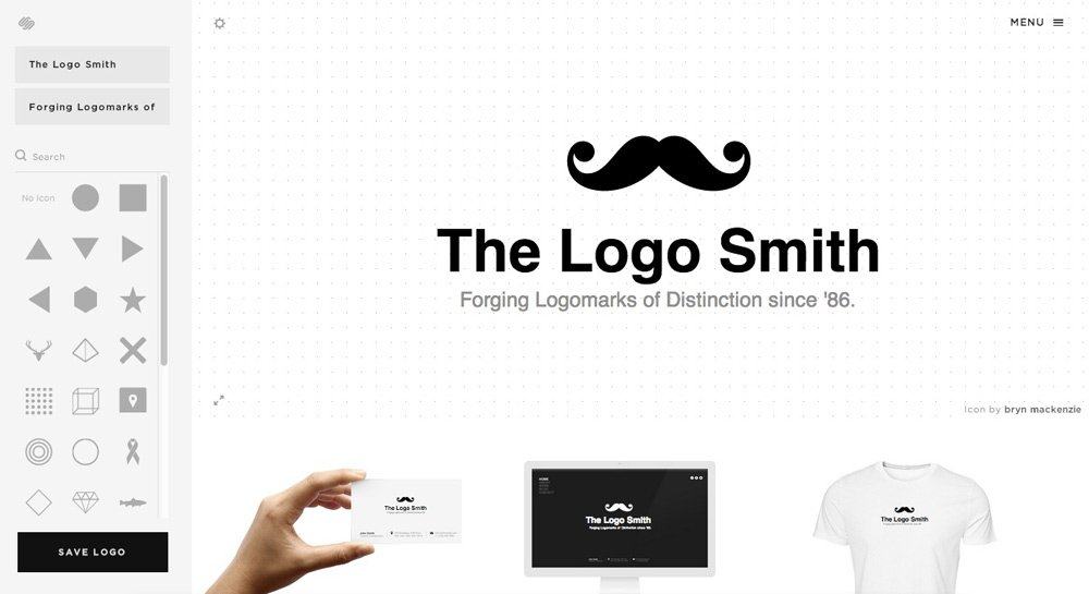
Squarespace logo design

I really have been a little taken aback (in a good way) by the number of people asking me for my opinion on: The Squarespace Logo Design Machine, so here’s my tepid reply.

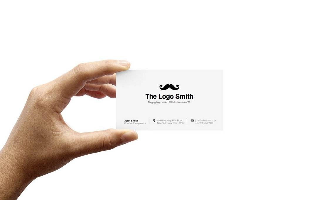
As you can see, my The Logo Smith logo came out really well when having tasked The Squarespace Logo Design Machine to assist me with this little experiment: to update my own logo and identity.

The ‘moustache’ icon, designed by Bryn Mackenzie, is such a perfect fit for the ‘distinction’ part of my tag-line, and it goes without saying I used Helvetica—shame only Bold or Regular, as I used Helvetica Black, but no biggy—so for me, I’m completely thrilled to bits with the result: Squarespace Logo has transformed my logo.

I didn’t even have to pay the $10 as I simply downloaded the watermarked version (I’ll donate $10 to a dog shelter), and screen-grabbed the images you see here. Not sure that’s entirely ethical, but hey.

I’ve had so much fun with this…

Squarespace logo design

Squarespace logo design

I’ll come right out and say: I have already recommended The Squarespace Logo Machine service to some non-potential clients, as they didn’t want to spend the £1000′s I usually charge.

This is a far better solution for cash-strapped clients than using 99Designs, or hell, Fiverr. Anyone, and I mean anyone, now has the ability to create a logo design that will always far exceed anything you’ll get off Fiverr, and for only double the cost!

They may be a little limited in font choices, and Noun Project icons, but that there is the reason Squarespace logo will be popular. By providing some basic constraints, a non designery client would have to be a complete nonce to mess this up.

The general aesthetic that spews out of The Squarespace Logo Design Machine is of the ‘minimally flat’ variety, and given we are already here with flat design, then Squarespace is saving us from the grim world of Fiverr and Microsoft Publisher gradient filled lumps of smelly poo.

Each design will be clean, presentable, and will instantly create a more beautiful world for us all.

For those designers who feel petrified that Squarespace Logo is a viable threat to their own supply of clients, then you simply need to look at another career choice. For those that have ethical quibbles, then you should really just be thankful that Squarespace Logo is making it possible for cash-strapped/stingy clients to at least have access to aesthetically flat, and clean, designs. Also, don’t be such a selfish, head-up-your-own-crystal-ass, narrow-minded jack-ass.

However, not sure where we’ll end up when there are a gazzilion companies using my ‘moustache’ to represent their brand… then I might have to get a little protective of my intellectual property.

Squarespace logo design

Read The Thrill of The Squarespace Logo Design Machine on The Logo Smith - forging logomarks of distinction since '86.

Preview of Preliminary Logo Design Idea for Logixoft

$
0
0

logo-design-by-the-logo-smith-2

Logo Explanation

The ‘X’ logomark sort of came about through some abstract sketching, trying to find some ‘hook’ within the brand name that could be used with a logomark. Often one looks at the initial when forming a logomark around the name, but after looking at various ‘L’ options it was apparent it would not really work.

The ‘X’

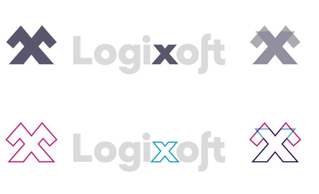
I ended up looking at the ‘x’ as the ‘hook’ to base a logomark from, but given x’s in general are somewhat common, it needed to hold it’s own and actually create a statement in itself, rather than just an initial/letter for the sake of it.

You can see from the diagram (below) how both x’s share the same form.

logo-design-by-the-logo-smith-2

With the main keywords from the brief churning around, I saw a way to almost personalise Logixoft, or at least create a form of symbol that could be linked to a personality rather than a random/abstract object thus giving your brand a more personable feel. Immediately, the angular formation of the ‘x’ with short-arms, makes the brand less clinical and thus more memorable, and especially as Logixoft is just you.

The angular and steep nature of the ‘little x-man’ also then comes across as being strong, powerful, bold, decisive, reassuring, confident signifying ‘you’ have your clients’ back and good intentions when they need it most.

Also this ‘X’ will work brilliantly at small sizes: favicon, social media profile images etc. Maybe some without the container/shield, some with.

logo-design-by-the-logo-smith-2

Mountains/Solid as a Rock

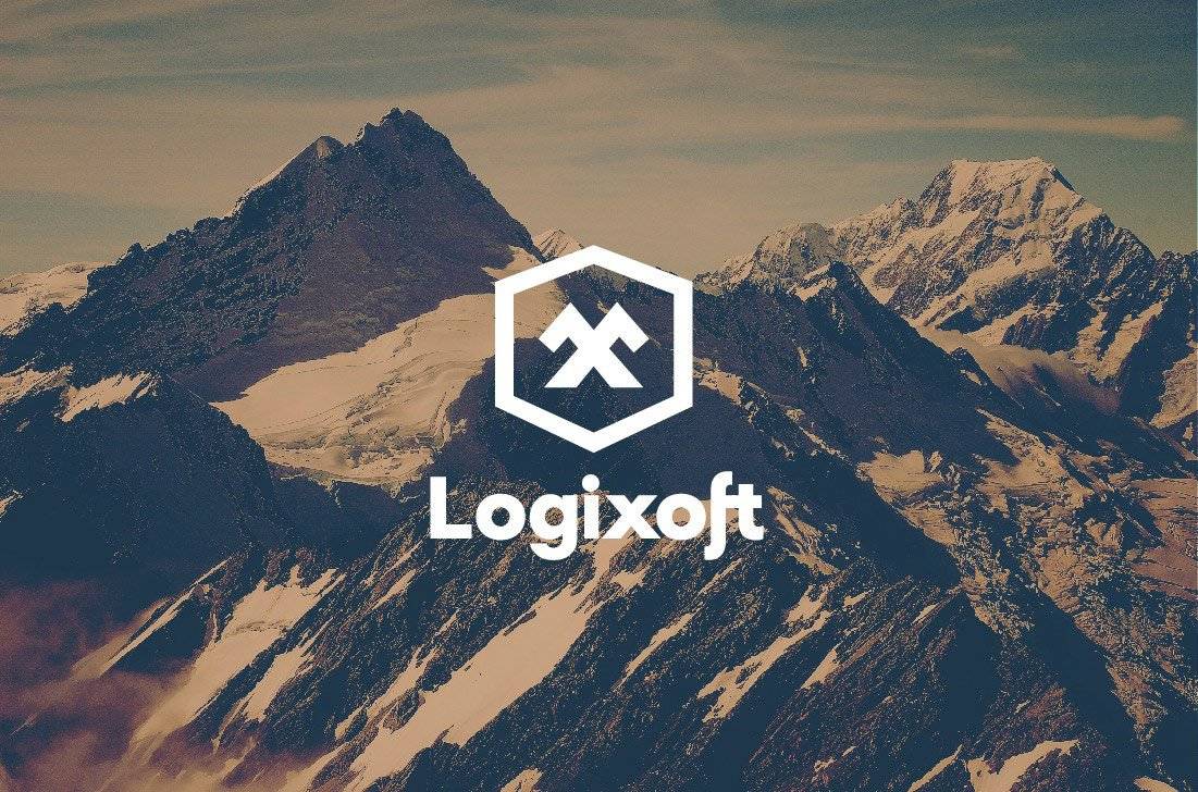
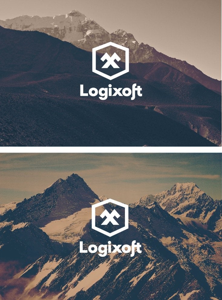
From playing with this shape, and trying to find some imagery to mock-up some layouts, I came across some stunning photographs of mountains (Mount Cook National Park, on PicJumb.com, and taken www.zivotnacestach.cz), and the similar angular nature seemed another perfect fit, and instead of just using it to provide context, I realised we could utilise this sort of imagery as supporting brand identity styles.

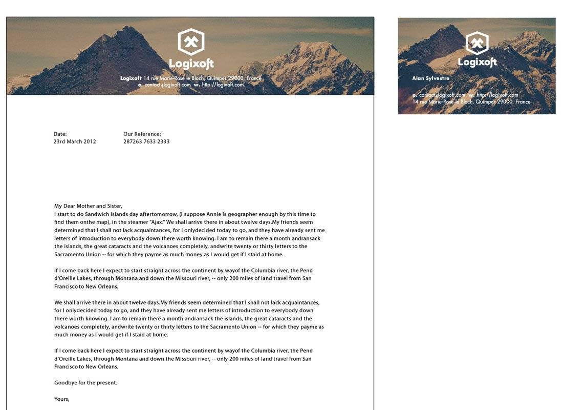
You can see from the letterhead and cards how this could work. The top half of the logo’s container is almost the same angle as the mountain behind it, more of a coincidence, but when I placed the logo over the photograph it immediately hit me, so that’s one more visual link that is shared.

Logo Design

Personally, and professionally, this has turned out as a far far more meaningful, and logical identity design, than I had initially anticipated.

For a company that is ‘security’ themed, we have managed to completely avoid clinical, cliche, cheesy imagery/meanings in the logo and identity, and instead created something with strong, clean, logical and applicable implied visual meanings and associations. The winning element is that it’s also a personable brand, but without being too personable, if that makes sense. The X-Man is not really a ‘mascot’, but could be, at a stretch, viewed as such. Another association I like is that you’re security products are: ‘strong as a rock’.

Font Selection

The wording is based on a font called RennerBoldArchiType, but I have customised the ‘L’, the ‘x’ a little, and also the ‘f & t’ to form a faux ligature, and overall works really well with the logomark. As the logomark is very angular, the font adds some softness and approachability.

Read Preview of Preliminary Logo Design Idea for Logixoft on The Logo Smith - forging logomarks of distinction since '86.
Star Wars Icon Set-Free Download by Jory Raphael

$
0
0

starwars-icons-designed-by-Jory-Raphael

These Star Wars icons were initially designed as part of an icon-a-day (year of icons) project, furiously designed by Jory Raphael (@sensibleworld), who incidentally, also masterminded the popular Symbolicons.

Jory has now combined all the individual Star Wars icons, and packaged them up as one complete Star Wars Icon Download.

Jory Raphael: “I thought it was time to update my free Star Wars icons. I posted a bunch last November, but have since added a few new icons. You can have them. For free.

The new set includes the following free Star Wars icons: a millennium falcon icon, a C-3PO icon, a Princess Leia icon, a Boba Fett icon, two lightsaber icons, a Death Star icon, a Darth Vader icon, an R2-D2 icon, a Storm Trooper icon, a Chewbacca icon, and the new additions for an AT-AT walker icon, an X-Wing icon, a Tie Fighter icon, an Admiral Ackbar icon, and a Yoda icon!”

Found via Macsparky

starwards_stormtrooper_icon starwars-death-star-icon Starwars-milleniumfalcon-icon Starwars--darth-vader-icon Starwars-c3po-icon Starwars-ATAT-icon

Read Star Wars Icon Set-Free Download by Jory Raphael on The Logo Smith - forging logomarks of distinction since '86.

In Progress: Custom Lettering-Preliminary Design Sketches

$
0
0

All posts, articles and logo designs © 2006-2013 Graham 'Logo' Smith: Forging Logomarks of Distinction since '86.

Custom Lettering for Logotype Design

In Progress: Custom Lettering-Preliminary Design Sketches

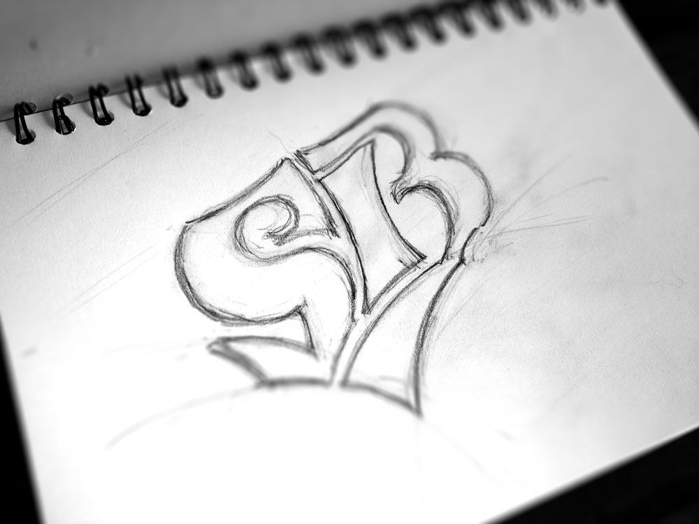
Nothing like a blank-slate when tasked with designing some custom lettering for a new logotype. Far from what will be the final design, but I just wanted to sneak out a few preliminary sketches that I have been working on.

This version here must be sheet 20, or something close, but none of the earlier iterations were ‘a waste of time’, as each new blank sheet of paper allows you to really explore a wide gamut of ideas, some promising some purposely crazy.

Sometimes where the promising and crazy collide, that Eureka moment could slowly manifest itself as you once again put lead-to-paper.

Custom Lettering for Logotype Design

I’m actually liking how this custom lettering is going, but with a few days since doodling this example, I can now see that the S is somewhat too bulbous on the top left, but now I can see that flaw, I can once again whip out another sheet of paper and hopefully address that issue. For sure, only to find something else that doesn’t quite fit with my vision.

The sketching process can be fun, challenging, frustrating, even damn right arduous, but it’s rare to come out at the end without something solid to work on for that final logo iteration.

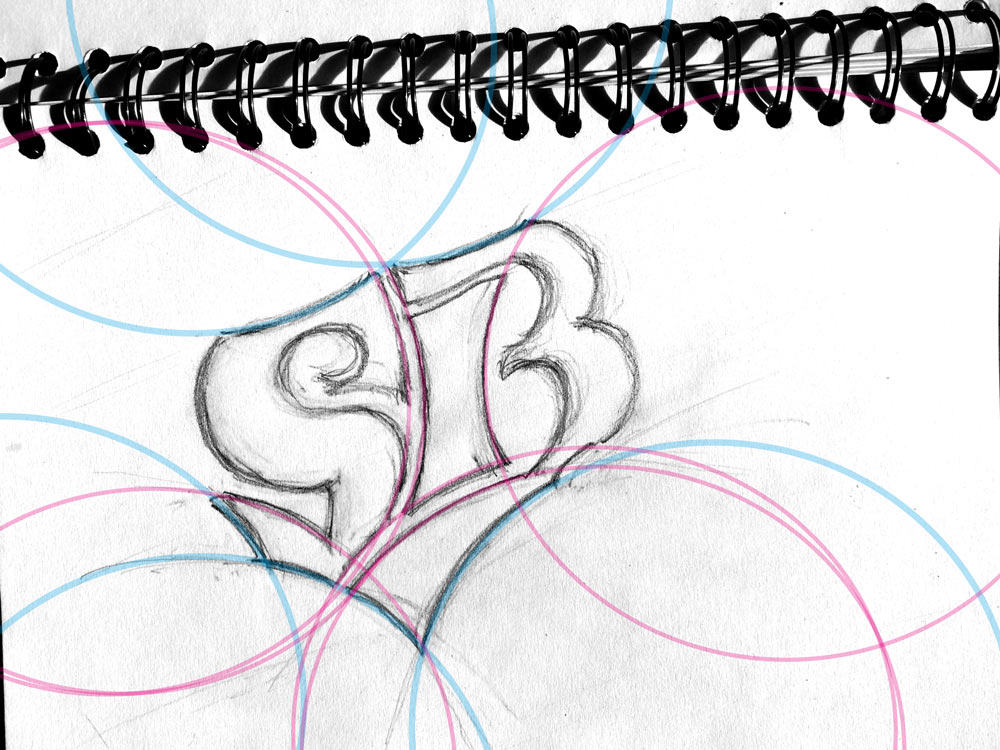
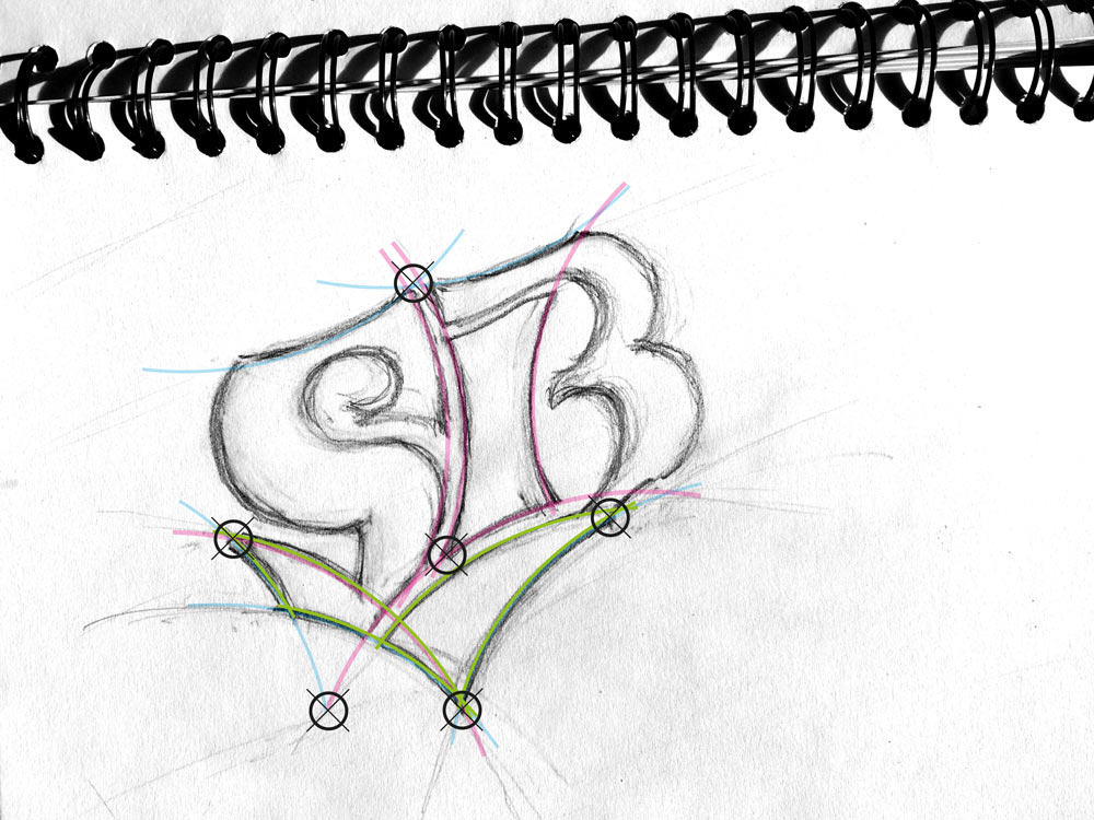
For shits-&-giggles, I just quickly placed some pretty coloured circles to show the sort of the flow that I’m bringing into the custom lettering and overall structure of the logotype. I like things to converge, to line-up, to intersect, where it’s naturally appropriate to do so. In this case it’s actually the green area that I have started each sketching session with, as this is the base platform from which the S & B rise from. Lots of sweeping curves, behind-the-scenes, that share the same overall circumference, and that all work together in one way or another.

Custom Lettering for Logotype Design


Read In Progress: Custom Lettering-Preliminary Design Sketches on The Logo Smith - forging logomarks of distinction since '86. All posts, articles and logo designs © 2006-2013 Graham 'Logo' Smith: Forging Logomarks of Distinction since '86.

If you need a logo designed, if no one else can help…

$
0
0

All posts, articles and logo designs © 2006-2013 Graham 'Logo' Smith: Forging Logomarks of Distinction since '86.

I need a logo designed

Yup, gratuitous self promotion time.

Frankly, it’s been a somewhat sloth pace like start to the year, and a couple of logo project cancellations has left me with more space in my calendar than I would like.

“I need a logo designed!”

If you are looking for a ‘professional’ logo designer—I do so much hate using that overused word, professional, it just makes one sound so dick’ish, but there are reasons to use it on very rare occasions, and for me, this is that one rare occasion—to craft you a meticulously appropriate new logo design, then I’m certainly keen and very able capable.

To help you find your feet, and steer you in the right direction, here are some useful page links for you (hopefully in order of usefulness):

  1. Logo Design Portfolio
  2. Price Guide
  3. FAQ’s
  4. Enquiries
  5. Logo Design/Creative Brief (this is a somewhat lengthy form that ultimately needs to be completed before a logo project can start, so feel free to jump straight right in with this)

If forms and things aren’t your thing, then please do feel free to just call me up to discuss: 07816 527 462.

Let’s create sweet sweet magic together…

Read If you need a logo designed, if no one else can help… on The Logo Smith - forging logomarks of distinction since '86. All posts, articles and logo designs © 2006-2013 Graham 'Logo' Smith: Forging Logomarks of Distinction since '86.

Tumblr Gets A New Logo – See What’s Different Between The Old and New Tumblr Logo

$
0
0

All posts, articles and logo designs © 2006-2013 Graham 'Logo' Smith: Forging Logomarks of Distinction since '86.

New Tumblr Logo Design

I actually love it when a brand redesigns their logo, but due to the subtleness of the logo design—in this case, more of a freshen up than a redesign—the roll-out ends up being somewhat low-key. Can’t say I have my ear completely glued to the ground, but I do like to think I’m reasonably up on logo news, and sometimes even catching new stuff like when Flickr recently changed a colour in their logo.

I only caught a whiff of the new Tumblr logo this morning, over on Brand New: Blink and You’ll Miss it, whilst catching up on my RSS feeds.

Practice Restraint

It’s one of those logo updates that just completely makes sense, restraint was practiced (which I always really admire when it’s done right) with careful attention to the new letter shapes and their overall connectedness as a whole.

Overall, the new Tumblr logo feels: more tumblier (bouncier?) and friendlier, yet at the same time also more refined, solid, and as musicians would say: tight.

The Tumblr in-house design team seems to have completely nailed this one good and proper.

The one down-side, which seems to be a general consensus across the internet, is that that the ‘u’ looks a bit odd where it’s missing the upper left serif. More so because the m, b, l and r still have it, so has a somewhat lack of consistency, but nothing major. I can see it annoying some people…

As a little side-note: This is a nice little lesson in logo redesign restraint that Yahoo (Marissa) should, at some point, ponder over. Almost a shame Tumblr didn’t do this first before Yahoo completed nuked their own logo redesign.

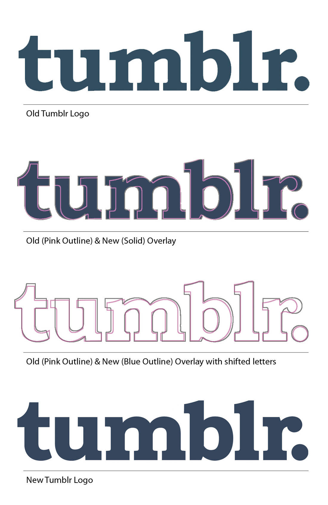
New & OId Tumblr Logo Comparison

Just mocked-up a quick logo sheet with the old and new Tumblr logo as a couple of overlays, so you can better see where each letter has changed. In fact, some of the changes: specially the ‘r’, do look pretty major when you look at the letters individually, but when the logo is viewed as a whole, not so much.

With the 3rd example titled: “Old (Pink Outline) & New (Blue Outline) Overlay with shifted letters”, all I did was to shift the letters sideways a little so each letters overlay was aligned more vertically aligned

New & Old Tumblr Logo Comparison

Tumblr’s Logo Guidelines

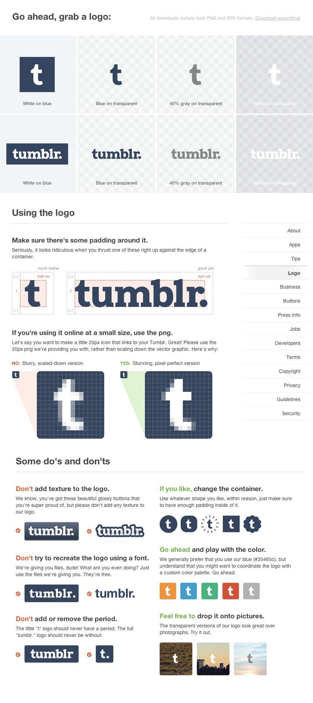
Loving Tumblr’s simple, and lighthearted set of logo guidelines.

Far from being anal like Twitter, Tumblr are allowing some flexibility in the use of their logo, such as using different colours of the initial ‘t’ logo, and even use different style containers. Great to see a brand as entrenched into society as Tumblr is, still allowing a decent amount of flexibility in the practical use of their brand ID.

Way to go.

Tumblr Logo Guidelines


Read Tumblr Gets A New Logo – See What’s Different Between The Old and New Tumblr Logo on The Logo Smith - forging logomarks of distinction since '86. All posts, articles and logo designs © 2006-2013 Graham 'Logo' Smith: Forging Logomarks of Distinction since '86.
Minimal, modernist silkscreened posters of Wes Anderson films, designed by David Klinker

$
0
0

All posts, articles and logo designs © 2006-2013 Graham 'Logo' Smith: Forging Logomarks of Distinction since '86.

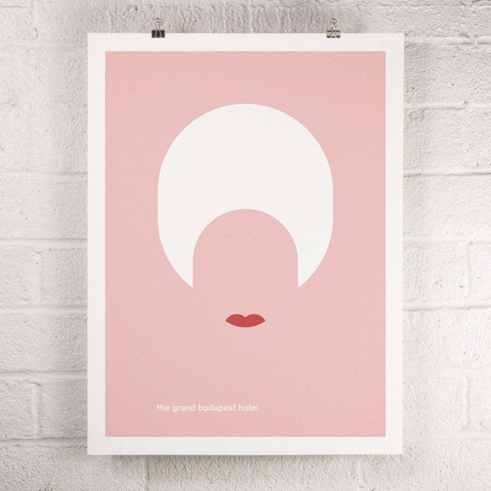
Wes Anderson Film - The Grand Budapest Hotel screen print poster

Lovely package of minimal, modernist silkscreened posters which are inspired by Wes Anderson’s films, all designed by David Klinker from Orange & Park.

The whole project is titled: Swiss Anderson, the reason being all the silkscreened posters set in Aksidenz Grotesk, which is nice. :)

Kickstarter: A series of eight minimal, modernist silkscreened posters inspired by the films of Wes Anderson. My name is David Klinker and I’d love your help to create a series of original screen printed posters. Water-based inks on 100% recycled paper, typeset in Akzidenz Grotesk medium, made in the USA.I designed one poster per movie for all eight of Wes Anderson’s feature films, fromBottle Rocket to his latest, The Grand Budapest Hotel. Each 18″ x 24″ poster depicts a different character from each film, in a style that will appeal to fans of minimalist Swiss and international graphic design.

These will be printed using traditional silkscreening techniques in Ypsilanti, Michigan, on 100% recycled Speckletone 100# paper from French Paper Company, which is produced under 100% hydropower in Niles, Michigan.

The prints.1 Bottle Rocket

2 Rushmore
3 The Royal Tenenbaums
4 The Life Aquatic
5 The Darjeeling Limited
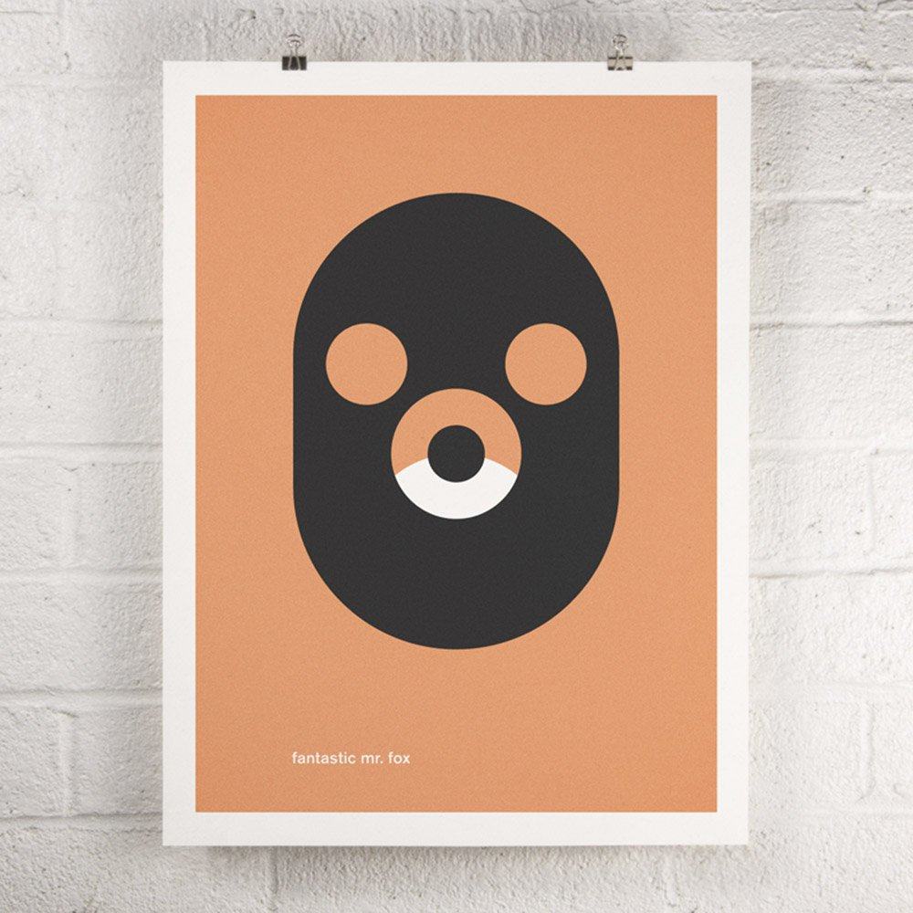
6 Fantastic Mr. Fox
7 Moonrise Kingdom
8 The Grand Budapest Hotel

This set of posters are part of a new Kickstarter project, with a funding goal of $1,500.

Wes Anderson Film - Moonrise Kingdom screen print poster Wes Anderson Film - Fantastic Mr. Fox screen print poster Wes Anderson Film - The Darjeeling Limited screen print poster Wes Anderson Film - The Life Aquatic screen print poster Wes Anderson Film - The Royal Tenenbaums screen print poster Wes Anderson Film - Rushmore screen print poster Wes Anderson Film - Bottle Rocket screen print

Read Minimal, modernist silkscreened posters of Wes Anderson films, designed by David Klinker on The Logo Smith - forging logomarks of distinction since '86. All posts, articles and logo designs © 2006-2013 Graham 'Logo' Smith: Forging Logomarks of Distinction since '86.
The New Le Mans 24 Hours Logo Design – Shakes Head

$
0
0

All posts, articles and logo designs © 2006-2013 Graham 'Logo' Smith: Forging Logomarks of Distinction since '86.

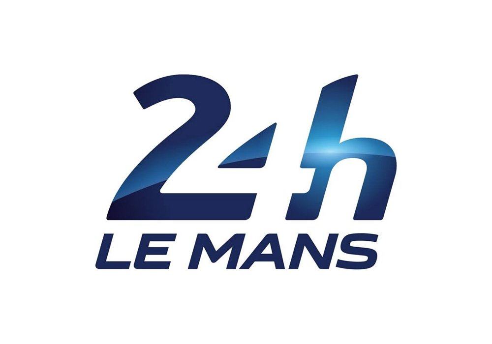
24 Le Mans Logo


Allowed some time to collect my thoughts, upon seeing the new Le Mans 24 Hours logo, before sharing. I always try to be—well not always, but try to try—constructive when I’m sharing my thoughts about a logo design created by another logo designer.

After all, there is no joy whatsoever in hearing negative remarks about ones own work. To be perfectly fair, and brutally honest, being any kind of artist immediately draws the spot-light upon you, be it for good or for worse, and well, we just ideally need to take the knock-downs with the re-ups.

Saying all that, I do feel the need to state my disappointment in the new Le Mans 24 Hours logo design, and not really sharing the opinions over at BrandNew either, which is pretty much a first.

Le Mans: ”Henceforth, the Le Mans 24 Hours has a new visual identity thanks to the new logo designed by the Leroy Tremblot agency. An event like the Le Mans 24 Hours is based around a central dimension — its legend. And this legend has been carefully forged since 1923 thanks to four sacrosanct values: innovation, popularity, performance and variety. These four values can be found in the new logo, which also transforms the identity of the event to a brand concept.

This new sign replaces a logo that dates from 1978 and it coincides with the introduction this year of new technical regulations for the Le Mans blue riband category, the LM P1s (download hereafter).”

Mutton Dressed as Lamb

Take away the gloss, the shiny metallic paint job, the ‘blue riband category’ (see press release above) and what you see is—and what I immediately saw through the thick paint and lacquer job—the unbalanced nature of the logo.

First thing that hit me was, “what the hell is happening to the top of the# 2?”

I get streamlined car bonnets, curves, fading roads into the distance, but this simply looks like a catastrophic attempt at using some tool in Illustrator for the first time. A little more thickness at the top, maybe even a little more depth, a little thinning out around it’s waist would have made such a difference, in my personal opinion of course.

Given the #2 leads us in, it’s such a shame it looks so oddly shaped with it’s sturdy waistline, it’s dainty base, and the thinning on top. Almost feels like a good attempt at a first draft.

The baseline width of the #2, and thusly, the width of the #4, also seem a little too wide to me, in my personal opinion of course. I know there are often trade-offs with this method of creating something from nothing (negative/positive space), but even so, this could have been done a lot lot better, I really believe that.


24 Le Mans Logo


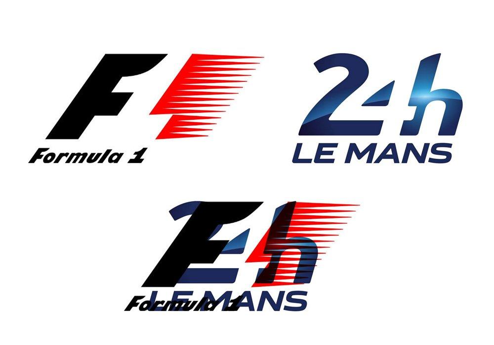
Reverse the logo (which is how it is primarily presented on the Le Mans website), and you see even more clearly the discrepancies between each letters shape and form, and how the #4 almost feels like it’s been shoehorned in, not so with the F1 logo.

The ‘h’ is really the only solid letter going on here. Oh, and the Le Mans wording is also solid, guess that’s a good thing because it literally is having to carry the rest of the logo.

Formula 1 vs Le Mans 24 Hours

For us Formula 1 fans the similarity between both logos beckons some weary questions. I’m not ‘in the know’ enough to question if there is actually some kind of business connection between F1 and Le Mans, in which case excellent, bring some consistency. However, I feel this is probably not the case, and the similarity is simply more than a similarity shared with another motor racing organisation. If one is going to use inspiration from another design, then please do try a little harder to do it justice.

For such a prestigious event, I feel this opportunity to redesign the Le Mans 24 hour logo was simply not grasped. It’s really quite disappointing. Oh, and thinking about it, I wasn’t that impressed with Caterham’s 2012 F1 Team logo either…

Formula 1 vs 24 Hours Le Mans

Quick comparison below shows they also share, pretty much, the same boundaries, give or take.

24 Le Mans Logo 24 Le Mans Logo

Read The New Le Mans 24 Hours Logo Design – Shakes Head on The Logo Smith - forging logomarks of distinction since '86. All posts, articles and logo designs © 2006-2013 Graham 'Logo' Smith: Forging Logomarks of Distinction since '86.

Hazy Evening Sun: Seaford Beach Photograph – Free To Download and Use

$
0
0

All posts, articles and logo designs © 2006-2013 Graham 'Logo' Smith: Forging Logomarks of Distinction since '86.

Hazy-Evening-Sun-Seaford-Beach-Low-Res-Photograph


Hazy Evening Sun: Seaford Beach Photograph

“One of my favourite photographs of Seaford beach, early evening. Taken during a brief lull in the recent storms that have hit the UK”.

I have a vast selection of scenic, landscape, architectural photographs spanning back many years and decided to select, and designate a number of them as Free To Download and Use, with the following Creative Commons designation (below). Exactly in the same manner as website like: Gratisography, Unsplash and PicJumbo

Further photographs will be posted on this blog, and categorised under Free Photography. So feel free to sign up to my Newsletter or RSS, or simply come back and check from time-to-time.

No Copyright

This license is acceptable for Free Cultural Works.
The person (Graham Smith) who associated a work with this deed has dedicated the work to the public domain by waiving all of his or her rights to the work worldwide under copyright law, including all related and neighbouring rights, to the extent allowed by law.

You can copy, modify, distribute and perform the work, even for commercial purposes, all without asking permission. See Other Information below.

Read Hazy Evening Sun: Seaford Beach Photograph – Free To Download and Use on The Logo Smith - forging logomarks of distinction since '86. All posts, articles and logo designs © 2006-2013 Graham 'Logo' Smith: Forging Logomarks of Distinction since '86.

How Many Times Can You Spot My PureStorage Logo In This Funny Promo Video?

$
0
0

All posts, articles and logo designs © 2006-2013 Graham 'Logo' Smith: Forging Logomarks of Distinction since '86.

http://vimeo.com/42294236

Never ceases to amaze me how cool PureStorage is as a company, and the lengths they are prepared to do to market and advertise their company. Obviously it’s super cool for me seeing the PureStorage logo I designed for them being applied in so many ways!

Great promo video… Oh, and who the hell are these cool dudes? :)

6754ea74-893a-11e3-97a3-12313d2f5560-large

Read How Many Times Can You Spot My PureStorage Logo In This Funny Promo Video? on The Logo Smith - forging logomarks of distinction since '86. All posts, articles and logo designs © 2006-2013 Graham 'Logo' Smith: Forging Logomarks of Distinction since '86.
The Pure Storage Logo Now Made with Lego Bricks

$
0
0

All posts, articles and logo designs © 2006-2013 Graham 'Logo' Smith: Forging Logomarks of Distinction since '86.

PureStorage Logo Flash Array in Lego Bricks

This has to be one of the coolest things I’ve ever seen one of my logo designs being used/manipulated and/or recreated! A whole bloody PureStorage Flash Array made completely out of Lego.

Seriously, what the hell.

There is a back-story to this Lego version of the logo, it wasn’t like just done for kicks, although nothing wrong in that either. Back in 2012 PureStorage were exhibiting the Pure Storage flash arrays over at VMWorld. Part of the fun was running this live contest in which this Lego version was featured, and people had to guess how many Lego bricks were used.

Turns out someone ‘calculated’ the exact number of Lego bricks used: 6,128 bricks to be exact.

I’ve only just posted the funny PureStorage video which was over on Vimeo, but this completely takes things to a whole new level. So very exciting to see ones logo design being used in such exciting ways, and I’m just super proud that PureStorage are so behind the logo I designed for them.

PureStorage Lego Flash Array

PureStorage-Logo-Flash-Drive-Made-in-Lego

Pure Storage Flash Array

And to finish-up with, a proud looking Pure Storage Flash Array in all it’s glory. Notice that all the little air-vents are shaped from the Pure Storage logo.

Pure storage flash array stack

Read The Pure Storage Logo Now Made with Lego Bricks on The Logo Smith - forging logomarks of distinction since '86. All posts, articles and logo designs © 2006-2013 Graham 'Logo' Smith: Forging Logomarks of Distinction since '86.
Iconic Brand Packaging Simplified & Abstracted to Dots by Silas Amos

$
0
0

All posts, articles and logo designs © 2006-2013 Graham 'Logo' Smith: Forging Logomarks of Distinction since '86.

Kelloggs-abstracted

A while back there was a super duper cool study on dots, well, to be more precise, an interpretation of the Mona Lisa by Gary Andrew Clarke. Andrew took the Mona Lisa and remixed it down to 140 exact circular dots and even with this over simplification, and somewhat abstracted nature, it is clear to all what the dots represent (below).

Mono Lisa Remixed by Gary Andrew Clarke

From that particular art exploration of the Mona Lisa, Silas Amos took the ‘dot’ idea in a slightly different direction, and applied the abstract ‘dot’ simplification to certain icon brand packaging. Some of the packagings are pretty clear, some maybe not so much.

But I really do love any logo/brand project like this, and I in fact had my own ‘dot’ brand logo project called: Unevolved Brands, which ‘unevolved’ brand logos down to a most basic shape: a ‘dot/circle’. Which actually reminds me that there are plenty of new logos to Unevolve since I last posted, so might be tempted to add a few more over the next few weeks. (Apologies for the website theme, it’s somewhat outdated now, but should still be working)

These are not new, and have been around for a few years, but I rediscovered them on my old Posterous blog, so thought these are pretty cool to post again.

Doritos abstracted   Colmans-abstracted luckystrike-abstracted Marlboro-Red-abstracted Cheerios-abstracted Pepsi-abstracted CocaCola-abstracted Marmite-abstracted Walkers-abstracted


Design Gazette: “I had a few surprises – I naturally assumed Coke would reign supreme, but the slightly fiddly nature of the line and script did not survive the test. Kellogg’s though, with its more distinctive shape, fared far better. Colman’s turned out to have little left at this degree of abstraction, whereas Marlboro clearly still reads.

A couple of conclusions: firstly, the brands abstracted look pretty cool as art huh? Secondly, one would assume that putting super-bold graphics through the same filter that was applied to a murky, mostly brown, old master’s painting would leave them comparatively well placed – that this is not always the case suggests they might not all be as recognisable when abstracted as we would have assumed.

And finally, strong shapes on pack prove to offer the best chances of survival of this process to retain recognition. This is interesting if one considers that many consumers are shopping products with impaired vision and no glasses on – it’s quite an illuminating test of graphic equities in a world where packs are ‘read’ at a glance without 20-20 vision.

My thanks to Gary, the artist. You can see his excellent site (and buy very reasonably priced prints)here. Or if you are a brand manager, why not get him to convert your product into a piece of art for your office walls?”

Brand-thumbnails Branded-thumbnails-v21


Read Iconic Brand Packaging Simplified & Abstracted to Dots by Silas Amos on The Logo Smith - forging logomarks of distinction since '86. All posts, articles and logo designs © 2006-2013 Graham 'Logo' Smith: Forging Logomarks of Distinction since '86.
Type Hero #8: Glober Type System Designed by Ivan Petrov of Font Fabric

$
0
0

All posts, articles and logo designs © 2006-2013 Graham 'Logo' Smith: Forging Logomarks of Distinction since '86.

Glober font by Font Fabric


Glober font by Font Fabric

Glober font by Font Fabric

Glober font by Font Fabric

Some of the offers on Myfonts are simply ludicrous. When you consider HOW much effort, skill, passion goes into the research and development of just one font, let alone a complete typeface family, it does make me wonder how on earth they can sell the complete Glober Sans-Serif Type System: 18 weights, for (currently) £11.60 which is 90% off their recommended pricing.

This is a great type family to get your hands on: a beautiful selection of fonts—I’m particularly drawn to the thin/light and heavier weights—for such a stupid amount of money.

Font Fabric: “The Glober font family includes 18 weights – nine uprights with nine italics. It is characterized by excellent legibility in both – web & print design areas, well-finished geometric designs, optimized kerning, excellent web-font performance and legibility etc.

Inspired by the classic grotesque typefaces – Glober has his own unique style in expressed perfect softened geometric forms.

The font family is most suitable for headlines of all sizes, as well as for text blocks that come in both maximum and minimum variations. Glober font styles are applicable for any type of graphic design in web, print, motion graphics etc and perfect for t-shirts and other items like posters, logos.”

Glober font by Font Fabric

Type Hero for Logo Designers

Type Hero is where I pick out certain fonts and typefaces that I find particularly cool, useful, charming, endearing, value for money etc. For the most part the font choices will be geared towards styles that I feel would work well in a logo and brand identity design scenario.

MyFonts has become a steady source of font inspiration, so many will be sourced from there, but I will also highlight fonts direct from font foundries when possible.

Worth noting, I think, that all Type Hero suggestions are based on fonts I have myself purchased. I am indeed: talking the walk, and walking the talk.

Read Type Hero #8: Glober Type System Designed by Ivan Petrov of Font Fabric on The Logo Smith - forging logomarks of distinction since '86. All posts, articles and logo designs © 2006-2013 Graham 'Logo' Smith: Forging Logomarks of Distinction since '86.
Viewing all 224 articles
Browse latest View live