Quantcast
Channel: Resources Archives | The Logo Smith
Viewing all 224 articles
Browse latest View live

Type Hero #7: Korpo Serif designed by Mateusz Machalski

$
0
0

Korpo Serif, designed by Mateusz Machalski 3

Korpo Serif, designed by Mateusz Machalski 1 Korpo Serif, designed by Mateusz Machalski 2 Korpo Serif, designed by Mateusz Machalski 4

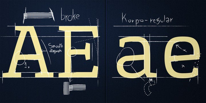
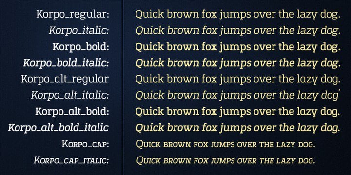
Another fab sale offer, on MyFonts, for Korpo Serif, designed by Mateusz Machalski. You can currently pick up this serif type family, consisting of 10 weights, for just $30 instead of $150:
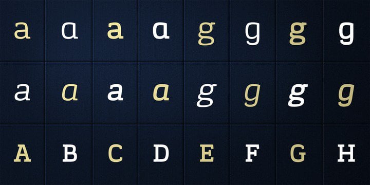
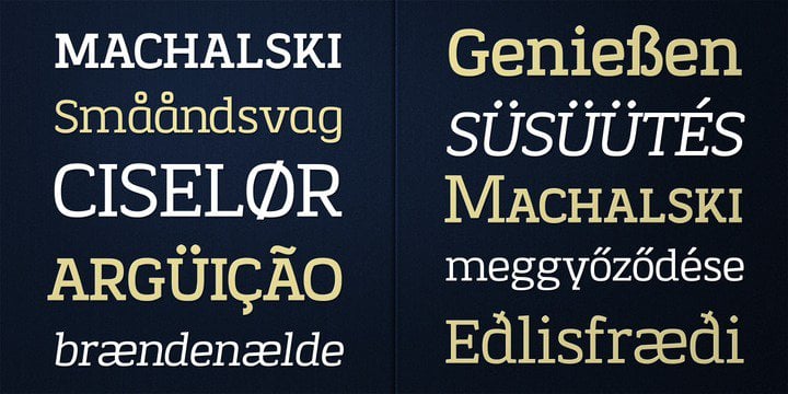
MyFonts on Korpo SerifKorpo Serif, designed by Mateusz Machalski, is a serif type family with a friendly feel. Serif style brings to mind egyptian or slab styles. This type contains 10 variants with two different “a” ang “g” glyph per style. Korpo contain Small CAPS in two styles. Broken details were made intentionally for better readability. The low contrast and high x height is perfect for longer text and Headlines.

Tend to find that finding a serif font that I like is usually quite tricky. There are plenty to choose from, but I have quite a specific idea of what a good, useable and versatile serif, espeically for logo designs, is thus it’s great when one surfaces like Korpo Serif. It has some presence, not too spindly or narrow, feels welcoming as well as having strength. Ticks all the boxes for me, and I’ve just downloaded it for a new logo project I’m currently working on.

Buy Korpo Serif, by Mateusz Machalski, for $30.

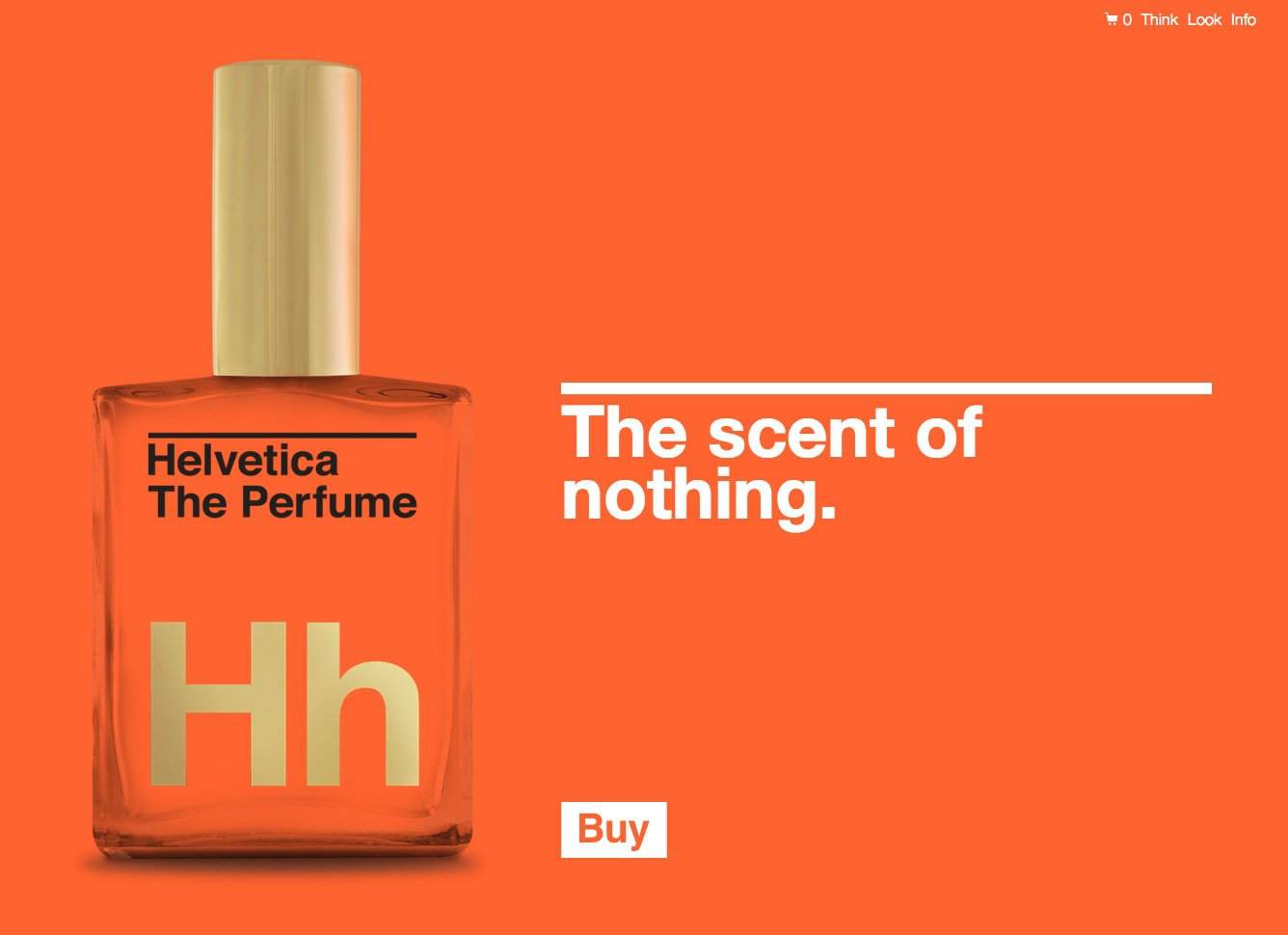
Type Hero for Logo Designers

Type Hero is where I pick out certain fonts and typefaces that I find particularly cool. For the most part the font choices will be geared towards styles that I feel could work well in a logo design.

MyFonts has become a steady source of font inspiration, so many will be sourced from there, but I will also highlight fonts direct from font foundries when possible.

I also have or have recently purchased all Type Hero fonts, so I am talking the walk and walking the talk.

Read Type Hero #7: Korpo Serif designed by Mateusz Machalski on The Logo Smith - logo & brand identity design portfolio and blog.


Carhartt Logotype WIP Process by Sergey Shapiron

$
0
0

Carhartt-WIP process by Sergey Shapiro 1

Carhartt Logotype WIP Process by Sergey Shapiron

Really enjoy studying these marvellous hand-drawn lettered sketches for Carhartt, by Sergey Shapiron. These have not been designed to replace the main Carhartt brand logo, but for an upcoming 2014 collection.

Sergey Shapiron: “Some of hand drawn/written sketches I did while working on a new t-shirt design for Carhartt-WIP 2014 collection. All sketches are scanned without any further tweaks done.”

Quite a variation in lettering styles with some being far less readable than others, but as it’s all exploratory work one has to take design to the limits in order to fully assess your ‘window of opportunity’, so-to-speak.

I have only selected a few of the Carhartt sketches, but there are loads more over on Sergey’s Behance profile.

Carhartt-WIP process by Sergey Shapiro 3 Carhartt-WIP process by Sergey Shapiro 4 Carhartt-WIP process by Sergey Shapiro 5 Carhartt-WIP process by Sergey Shapiro 6 Carhartt-WIP process by Sergey Shapiro 7

Carhartt-WIP process by Sergey Shapiro 9 Carhartt-WIP process by Sergey Shapiro 10 Carhartt-WIP process by Sergey Shapiro 11 Carhartt-WIP process by Sergey Shapiro 12 Carhartt-WIP process by Sergey Shapiro 13 Carhartt-WIP process by Sergey Shapiro 14

Carhartt Logotype WIP Process by Sergey Shapiron


Read Carhartt Logotype WIP Process by Sergey Shapiron on The Logo Smith - logo & brand identity design portfolio and blog.

Sketching Whilst on a Frustratingly Tiresome Hold with BT Helpline

$
0
0

Logo Sketches

After having my BT Broadband upgrade to BT Infinity brilliantly ballsed up by a BT contractor, leaving me with no broadband at all, I ended up having to making a number of horrifyingly frustrating calls to BT’s abysmal call service hotlines.

The calls to BT started at 6pm Monday evening, and after 4 separate calls, and talking to 6 different people in various parts of the world, I gave up the will to live at 11pm being no better off in getting my broadband up and working.

However, all this time on hold and listening to scripted questions, I ended up sketching some ideas for a logo project I’m currently working on. The one with the frame has a nice symmetry as the P and G are/would be the exact same form, just flipped vertically, with the H sitting behind, but gelling all 3 initials: PHG, together. It’s a little more interesting that just having 3 regular initials, and basically does become a logomark in it’s own way. It could be used independently of the full length typemark; Pleasant Hill Grain, for example, rather than being a regular logomark that typically always forms part of the whole logo.

I think twiddling my thumbs would have left me close to wanting to commit a terrible act upon myself to avoid the ongoing misery, but the doodling actually proved to be very soothing and actually actually lead to a decent idea to pursue further. Hadn’t previously seen that the P & G could be formed from the same shape thus creating a reasonable solid, and quite unique initialmark

Not sure what the moral is of this tale, but maybe always have a pen and some paper handy should you ever find yourself stuck in an infinite loop of BT helpline hell.


Read Sketching Whilst on a Frustratingly Tiresome Hold with BT Helpline on The Logo Smith - logo & brand identity design portfolio and blog.

Arial vs. Helvetica by OKFocus

$
0
0

arial-vs-helvetica


If you think this animated GIF showing the differences Arial and Helvetica is a little hard on the eyes, then you ain’t seen nothing yet. Dare you to click on the main image below… I mean seriously, have plenty of aspirin ready, and if you are epileptic, I would advise caution!

We can thank the people over at OKFocus for putting this educational typographic mini-site: Arial vs Helvetica, together.

» Via: The Fox is Black
» Source: OKFocus

Screen Shot 2013-09-06 at 11.35.28

Read Arial vs. Helvetica by OKFocus on The Logo Smith - logo & brand identity design portfolio and blog.

Animated Famous Brand Rivalries by Rodolfo Foitinho

$
0
0

656ddf9084f46f6bb938d6a9fa55ada7

coke pepsi brand rivalries


The Greatest Brand Rivalries is quite a cool brand project by Rodolfo Foitinho. Found it whilst checking out the Behance galleries for anything new for Logo Stack.

I was a little unsure at first, but scanning down his list of brands made me realise just how similar, in shape in a lot of cases, each brand item is. Yet, they can significantly vary in quality, perceived coolness etc. Just the overlapping of these shapes makes you realise how undifferent some brands really are when it comes right down to it. Obviously, in some cases, one brand got to design a unique form factor first, then the others follow suit, but in some cases the overall form just hasn’t changed in decades.

View more: The Greatest Brand Rivalries over on Rodolfo‘s Behance page.


e22034b57868f7dfb272a88d33f36e8d

12c56f5dbf72340b78322d0f6f86fa7c


428c40ebb581c2cb812adde0d0c3ffd3

1cf9901bd650aa659836c08c7f674159

43e97e202f6a1657db506c83fcccf8fd

Read Animated Famous Brand Rivalries by Rodolfo Foitinho on The Logo Smith - logo & brand identity design portfolio and blog.

Taking on New Logo Design Briefings

Mentioned: The Auto Network Logo Redesigned

$
0
0

Screen Shot 2013-09-12 at 18.35.27


Really nice to see the fruits of ones logo design work, The Auto Network logo, proudly adorning the header of the redesigned/updated website. Also a quick thank you to Rebecca Turnbull for the mention in their blog post: New branding for a new direction, The Auto Network works with Graham Smith

During the initial, and last, stages of the logo development I didn’t really have a clear idea of how their website would be redesigned and updated. This is quite a common way of working, at least for me, so it’s just really nice to see how the logo and website now seem to really gel quite nicely. The favicon looks pretty neat as well!


auto network header

the autonetwork logo deconstructed

You can see a larger version here: http://www.flickr.com and here: http://imjustcreative.com


Read Mentioned: The Auto Network Logo Redesigned on The Logo Smith - logo & brand identity design portfolio and blog.

NASA’s ‘Worm’ Logo Animated in 70′s Groovy Fashion

$
0
0

NASA worm logo animated

Not sure I’ve seen something this cool in ages. What could be more cooler than seeing the remarkably cool NASA ‘worm’ logo spinning into position like some 70′s take on travelling through a groovy wormhole whilst stoned.

Don’t leave without also checking out: NASA Identity Design Program

» Via: http://unifiedpoptheory.com/vintage-1977-nasa-video-talks-about-voyager/
» Source: Aeronautics And Space Report 1977

Two more animated NASA logos (below) from: It’s OK To Be Smart

NASA's 'Worm' Logo Animated in 70's Groovy Fashion

NASA's 'Worm' Logo Animated in 70's Groovy Fashion

Read NASA’s ‘Worm’ Logo Animated in 70′s Groovy Fashion on The Logo Smith - logo & brand identity design portfolio and blog.


Barbican Visual Identity Guidelines Book Designed by North

$
0
0

BARBICAN VISUAL IDENTITY GUIDELINES

Barbican Visual Identity Guidelines Book Designed by North

North has created the new Barbican visual identity guidelines book, to mark the start of the AGI Open: the annual international graphic design event which is being held at the Barbican for its inaugural London edition.

This is a sneek peek of the book which will be launched as a limited edition downloadable PDF on 23rd September.

Collate: ”The latest iteration of the guidelines have been developed in collaboration with the AGI member North, a design agency who have worked with the Barbican for over a decade to continually develop its visual identity in parallel with the evolving needs of the Centre’s vision and programme. The limited edition book will be available to purchase for £20 from the Barbican Shop, the Graphic Design Book Shop (26-27 September only as part of the AGI Open) and online here.”

Sources: [barbican.org.uk] [northdesign.co.uk] [Collate]

BARBICAN VISUAL IDENTITY GUIDELINES1c BARBICAN VISUAL IDENTITY GUIDELINES 1b BARBICAN VISUAL IDENTITY GUIDELINES 1a BARBICAN VISUAL IDENTITY GUIDELINES 1f BARBICAN VISUAL IDENTITY GUIDELINES1g BARBICAN VISUAL IDENTITY GUIDELINES 1h

Read Barbican Visual Identity Guidelines Book Designed by North on The Logo Smith - logo & brand identity design portfolio and blog.

Born Humanist Typeface-Free Download Designed by Carlos de Toro

$
0
0

banner-ancho-born-en2

Carlos de Toro emailed me with a lovely little note and a link to his website, more specifically a link to his gorgeous typeface, named Born. Carlos has clearly spent a lot of time, and put in a lot of love in the development and creation of his typeface, yet with all that Carlos is making Born a free download, but donations ARE obviously warranted I think.

In his words:

Carlos de Toro: “Born is much more than a typeface, it’s also a story; The one of my 2013. A story about moving to the big city, the result of meet great people from all parts of the world and their cultures too, the result of talks in classes, bars and trains… the result of sharing moments, experiences, knowledges… Born is the result of all these experiences and people: and now I’m sharing with you this piece of my story.

Specimen-Born-typeface-tipografia2

About Born

Born is a humanistic typeface that is based on traditional calligraphic forms, but with some new features in its endings, strokes and drops, that provide a more open, fresh and actual look. It also has a big X height, so it offers a high legibility even at small sizes.

Born typeface, born in Barcelona city at early 2013, bears the name of one of the most picturesque Barcelona districts, on the shores of the Mediterranean takes together the old and the traditional, and also the multicultural stuff and new trends, blending these in its narrow and winding streets, creating a symbiosis between tradition and modernity. This is a Mediterranean type, which it’s open to new times.

Born Includes

Regular Born includes a total of 262 glyphs: Uppercase, Lower case, Alternative glyphs of the above ones, normal Ligatures, Uppercase numerals and symbols and punctuation marks.

Specimen-Born-typeface-tipografiaSpecimen-Born-typeface-tipografia5 Specimen-Born-typeface-tipografia3 Specimen-Born-typeface-tipografia4

Read Born Humanist Typeface-Free Download Designed by Carlos de Toro on The Logo Smith - logo & brand identity design portfolio and blog.

Irina Blok Designed That Android Logo

$
0
0

android logo

I’ve always loved that cutesy Android logo, it’s one of the most distinct logos used by any communications brand that I know. Not only is it cute, but it’s supremely simple, ultimately flexible, and transcends the digital world into the real world effortlessly.

Who Made that Android Logo: a nice little article by The New York Times describing the humble beginnings of the Android logo, but one that didn’t make the designer, Irina Block, particularly famous at all.

Irina Blok may have drawn one of the most recognised logos in the world, but her association with the green Android has not made her famous. Blok can think of only one incident when she garnered the public’s attention for designing it. In 2010, she and her 6-year-old daughter were in a movie theater waiting for “Alice in Wonderland” to begin when an Android logo flashed on the screen. Her daughter, Blok recalls, suddenly stood up and yelled, “My mommy invented that!” Everyone in the row in front of them turned around to stare. Blok was so embarrassed, she says, that she sank down behind her tub of popcorn.

Read Irina Blok Designed That Android Logo on The Logo Smith - forging logomarks of distinction since '86.

Design Jargon Bullshit – A Tumblr

$
0
0

Design Jargon Bullshit

Fantastically funny Tumblr full of Design Jargon Bullshit. Some of these are just unreal, some are simply hilarious.

I think the less the logo/design actually relates to the brief, then the more colourful the bullshit becomes. I’m gonna die if I find one of my bullshit statements in here!

A sample:


» Via: The Fox is Black
» Source: Design Jargon Bullshit

Read Design Jargon Bullshit – A Tumblr on The Logo Smith - forging logomarks of distinction since '86.

Various Animated Logo Evolutions by Nick DiLallo

$
0
0

http://youtu.be/H5LIuf9mFEs

 
Just absolutely loving these animated logo evolutions by Nick DiLallo over on YouTube. Nick has animated the following brand logos for your entertainment: American Airlines, Starbucks, UPS, GAP (the funniest), Apple (love hearing those system sounds again!) and NBC.

Giving what’s happened in the world of the JCPenny logo, would love to see the back and forth with that one as well.

They’re not truly animated, as in the sense of morphing one logo version to the other, but I totally love this humorous take on them instead!

Probably worth subscribing to Nick’s YouTube page incase he releases any more!

» Via: BrandNew
 

http://youtu.be/dhW9Uvy6eZo


http://youtu.be/AiIv6ZBYbIw


http://youtu.be/XXLCO5E3MC0


http://youtu.be/txdpX-2b3qA


http://youtu.be/dXXHZDmbHPE

Read Various Animated Logo Evolutions by Nick DiLallo on The Logo Smith - forging logomarks of distinction since '86.

You’re “Probably” Not a Brand Designer

$
0
0

A must read article by Adrian Shaughnessy; “Why designers should give branding back its soul”, is a useful article of how the very definition of Brand and/or Branding, has lost it’s true meaning to many, including designers.

I’ve touched on this in the past, and it generally resulted in somewhat heated debates on Twitter, but typically the word Brand is used pretty liberally, and rarely in the correct way.

Unfortunately, Brand has become synonymous with logo and identity design, so if you are a logo and identity designer, it’s almost become necessary to append the word to ones job title/description because it’s a term that is used by customers/clients in their search for a logo and brand identity designer.

It’s also just a term that has infused itself into the logo and identity terminology over the last few years, to the point many designers incorrectly believe they can design a Brand. Adding it to your job description is, for a lot of us, simply playing a little fast & loose with the definition for the sake of being found, and hired, and milking Google SEO for all that you can.

There is also something quite complete about how Logo & Brand Identity sounds, but still doesn’t make you a Brand designer.

Even in my case, where I often describe what I do as being a logo and brand identity designer, I’m not comfortable with using the word because it’s simply inaccurate. I don’t create brands, I create logo and identities, as these are the aspects I have control over. What I don’t have control over, or experience in, is branding. My primary area of focus is designing logos/logomarks whilst carefully, and considerately, venturing into the realm of identity design, ergo I’m a Logo & Identity Designer.

Obviously there are specialist companies/agencies that focus on the much bigger, complex, mysterious area of: product, company and personal Branding, but for many a self-employed logo & identity designer, it is simply not a valid part of the job description.


Read You’re “Probably” Not a Brand Designer on The Logo Smith - forging logomarks of distinction since '86.

NASA Astronaut Leland D Melvin With Dogs Jake and Scout

$
0
0

NASA astronaut Leland D Melvin with his dogs Jake and Scout

This photograph of NASA astronaut, Leland D Melvin with his dogs Jake and Scout, just brings so much joy to my heart! Being a dog lover, I can just feel the excitement, the love and the happiness both Leland, Jake and Scout are all feeling.

Just look at Leland’s smile, then Scout’s eyes nearly popping out of his sockets.

Just beautiful.

» Found via: d


Read NASA Astronaut Leland D Melvin With Dogs Jake and Scout on The Logo Smith - forging logomarks of distinction since '86.


Abstract in Logo Design

$
0
0

Chase logo design

There really is quite a challenge behind designing a logo mark that is based on the abstract, rather than a more defined visual link to ‘entity’ one is creating a logo for.

Can’t say I get many clients actually asking for an abstract logo, and I’m pretty sure that’s simply down to a misguided notion that it’s a easy and quick ay for a designer to say ‘job done’, and with that a clear lack of value for money. If the client can’t say, “what does that logo have to do with my business? Nothing? Then why the hell do I want a logo that communicates nothing meaningful?”

Of course, that’s all poppycock. An good abstract logo is neither quick nor easy, and neither should a client dismiss the option of an abstract logo as being poor value for money. A client isn’t just forking out dosh for some hired help, they are paying for expertise, wisdom, and creative confidence to make decisions that a client is not in a position to make. One of those decisions might just be related to going with a logo design of an abstract nature, if they feel this is the best direction to take after dismissing more literal/obvious routes.

In this great article: To Abstract Or Not Abstract? looks at abstraction in logo and brand identity design, as well as other principles of identity design created by his firm, Chermayeff & Geismar & Haviv.

Tom Geismar saided to , “Since we did an abstract symbol for Chase, many have tried to do it in cases where they shouldn’t have.”

If we are doing our job as designers, our solution should always grow out of a well-thought-out strategy, and an abstract symbol is only one possible tactic among many.

Conservation International logo design

Read Abstract in Logo Design on The Logo Smith - forging logomarks of distinction since '86.

The Rio 2016 Olympic Pictograms

$
0
0

rio 2016 olympic pictograms sketches 2

rio 2016 olympic pictograms sketches 2 rio 2016 olympic pictograms sketches 2

From the Rio 2016 website:” Sport pictograms are graphic icons facilitating the visual identification of each sport and are a Games tradition. In 2016, each Olympic and Paralympic sport will be represented by a unique pictogram for the first time. The Rio Games have 64 pictograms – 41 Olympic and 23 Paralympic – and you can check them out below. Also see our image gallery of the creative process for the pictograms, learn about the origin of this tradition and share your favourite ‘picto’!”

These bouncy Olymoic pictograms for the upcoming Rio 2016 games were designed in-house, by the Rio 2016 design team. They were ultimately influenced from the custom made Olympic typeface which was designed by Dalton Maag, which was itself based on the original Rio Olympic logo.

Although not a style I’m particularly fond of, they do, however, work perfectly within the entire Rio brand identity. They look and feel perfectly at home, and each pictogram seems to clearly represent each sport etc.

Creative Review has a detailed walk-through on the Olympic pictograms: Rio 2016 Olympic pictograms unveiled

rio 2016 olympic pictograms 1

rio 2016 olympic pictograms 1


Read The Rio 2016 Olympic Pictograms on The Logo Smith - forging logomarks of distinction since '86.

The Typography Primer – Free PDF Download

$
0
0

The Typography Primer by Adobe

A lovely little, and useful, publication covering the basics of typography from Adobe. It was actually first published waaaay back in the day, circa 2000, but the contents are still very relevant over a decade later.

From Adobe’s blog post: “This primer was written back in 2000, but its content is still relevant today. It talks about things like using the right character, choosing and using typefaces, combining typefaces in a publication, and loads of other interesting typographic tidbits. If you follow our blog, you probably already know a lot about type. If that’s the case, why not take a look inside anyway? Think of it as a fun refresher when you need a break from work. Perhaps it’s even something you might share with a co-worker who longs to know more about the mysterious world of x-heights and optical sizes.”

Download the Typography Primer (few page grabs from the primer below)

The Typography Primer by Adobe The Typography Primer by Adobe The Typography Primer by Adobe

Read The Typography Primer – Free PDF Download on The Logo Smith - forging logomarks of distinction since '86.

Unsplash – Free Hi-Resolution Photographs

$
0
0

Unsplash – Free Hi-Resolution Photographs

Unsplash Tumblr – Free (do whatever you want) Hi-Resolution Photographs made by ooomf.com

Absolutely in love with Unsplash: finding myself coming back to the site several times a day just to check out the existing photographs even knowing it’s updated every ten days.

Hat tip to Ben Garratt for pointing me to the site.

Such a variety of photographic styles, and content, that you’ll almost certainly find something of value. As far as Tumblr websites go, this one is pretty special.

I have used a number of these as backgrounds to some logo designs, for both my portfolio and for client presentations. A recent example of a logotype idea I presented to a client:

Unsplash Photo Example

Some Classy Examples

Photograph Photograph Photograph Photograph Photograph Unsplash Photograph Unsplash Photograph Unsplash Photograph Unsplash Photograph Unsplash Photograph

Read Unsplash – Free Hi-Resolution Photographs on The Logo Smith - forging logomarks of distinction since '86.

Helvetica The Perfume: The Scent of Nothing

$
0
0

Helvetica The Perfume

You know? This is just class! I can easily see people stumping up the $62 to buy a bottle of, Helvetica The Perfume: The Scent of Nothing

Good packaging sells, and it can sell anything if you do it right, and I’m pretty sure the folks responsible (GutsandGloryand.us) for this have got this pretty damn right. Great website, good design, nice colours, and great great packaging. Did I mention great packaging? heck, it even has 24k gold printing as well as some letter-pressing happening.

I mean f**k, I’d even be tempted to buy a bottle just to put on my desk and stare at, even maybe fondle and caress.

This is what you get for your $62:

  • Numbered limited edition
  • 24k gold printing on bottle
  • Typeset in Helvetica Bold
  • Letterpressed exterior packaging
  • Contains 2 oz of distilled water
  • Shipped ready for gifting

You can follow the dedicated Twitter account right here: @HelveticaParfume and head over to the shopping page (it is legit) if you are dead eager to get your own bottle.

Hat-tip to Julie Bakopoulou for the heads-up.

Helvetica The Perfume

From the website: In 1957, Max Miedinger and Eduard Hoffmann set out to create a new sans-serif typeface for the Swiss design market. Their goal: to create a highly legible and completely neutral expression of the Modernist design movement to which they belonged. This typeface was to have no intrinsic meaning, allowing the content to convey the message.

Helvetica has gone on to become arguably the most ubiquitous and widely used typeface in history.

It is in this spirit that we have created the ultimate Modernist perfume – a scent distilled down to only the purest and most essential elements to allow you, the content, to convey your message with the utmost clarity.

Air. Water. You.

Helvetica The Perfume Helvetica The Perfume Helvetica The Perfume

Read Helvetica The Perfume: The Scent of Nothing on The Logo Smith - forging logomarks of distinction since '86.

Viewing all 224 articles
Browse latest View live